CheckBoxW class
A CheckBoxW is a check box: a small box with a caption beside it, which the user checks and unchecks, and which the program can also show grayed. It can show a picture, look like a push button that stays down while it is checked, and leave its drawing to the program.

CheckBoxW1.Caption = "&Remember " & ChrW$(&H3A9)     ' the caption is Unicode: a Greek capital omega
CheckBoxW1.Value = vbChecked
Debug.Print CheckBoxW1.Value
CheckBoxW1.Value = vbGrayed
Debug.Print CheckBoxW1.Value; Len(CheckBoxW1.Caption)
' Output:
'  1
'  2  11
The control stands in place of the CheckBox of VB6, which in twinBASIC is the CheckBox of the VB package. This one adds a picture from an image list beside the caption (ImageList), PushLike, WordWrap, TextAlignment and VerticalAlignment, Transparent, and drawing by the program (DrawMode).
Of the common members, the control has those under Name and place, Window handles, Font and visual styles, Mouse but DblClick, Keyboard and focus, Dragging the control, OLE drag and drop and Right-to-left but RightToLeftLayout. Its Click event has a meaning of its own.
- Checked, unchecked and grayed
- Caption and pictures
- The graphical style
- Drawing the control in code
- Properties
- Events
- ChkImageListAlignmentConstants
- ChkDrawModeConstants
- See Also
Checked, unchecked and grayed
Value is the state of the box: vbUnchecked, vbChecked or vbGrayed. The user changes it with a click on the control, with the space key while the control has the focus, and with the Alt key and the character that follows an & in the Caption.

Each of these checks an unchecked box and unchecks a checked or a grayed one. Only the program makes the box grayed.
Value also takes True and False, as checked and unchecked. Any other number raises run-time error 380, Invalid property value.
CheckBoxW1.Value = True
Debug.Print CheckBoxW1.Value
On Error Resume Next
CheckBoxW1.Value = 3
Debug.Print Err.Number; CheckBoxW1.Value
' Output:
'  1
'  380  1
Every change of Value raises Click, whether the user or the program made it:
Private Sub CheckBoxW1_Click()
    Debug.Print "The box is now "; IIf(CheckBoxW1.Value = vbChecked, "checked", "not checked")
End Sub
Caption and pictures
In the standard Style the control shows its box and, beside it, either the Caption or a picture. Alignment puts the box at the left or the right of the control. TextAlignment, VerticalAlignment and WordWrap place the caption in the room that is left.
A picture comes from one of two places:
- Picture is shown in place of the caption.
- An ImageList control assigned to the ImageList property is shown together with the caption, at the side that ImageListAlignment names and at the distance of ImageListMargin from the edge. The control shows the image list’s pictures when the program has visual styles. While an image list is assigned, Picture is not shown.
The image list holds one picture, which the control shows in every state, or one picture for each state in this order: normal, under the mouse, pressed, disabled, with the focus, under a pen.
CheckBoxW1.ImageList = ImageList1
CheckBoxW1.ImageListAlignment = ChkImageListAlignmentRight
CheckBoxW1.Caption = "Show &hidden files"
The graphical style
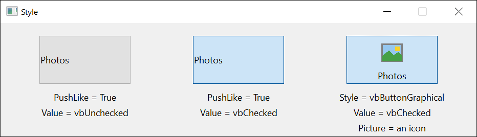
With Style set to vbButtonGraphical the control is a push button that stays down while it is checked, drawn by the control itself: the picture in the middle and the caption under it, centered. Picture is the picture of the button when it is up, DownPicture when it is down or checked, and DisabledPicture when it is disabled. With UseMaskColor the color MaskColor of a bitmap is not drawn. The button has the BackColor and the caption the ForeColor.
In this style Alignment, TextAlignment, VerticalAlignment, WordWrap, PushLike and ImageList have no effect.
PushLike is the other way to a button that stays down: it keeps the standard style, so the caption’s alignment and the image list still apply, and Windows draws the button.
Drawing the control in code
With DrawMode set to ChkDrawModeOwnerDraw the control draws nothing. It raises OwnerDraw each time it has to be drawn, and the handler draws the whole control, its state included, on the device context the event gives it.
The graphical style and this mode exclude each other. Setting Style to vbButtonGraphical in this mode raises run-time error 383, and setting DrawMode to ChkDrawModeOwnerDraw makes a graphical Style standard.
CheckBoxW1.Style = vbButtonGraphical
CheckBoxW1.DrawMode = ChkDrawModeOwnerDraw
Debug.Print CheckBoxW1.Style
On Error Resume Next
CheckBoxW1.Style = vbButtonGraphical
Debug.Print Err.Number; CheckBoxW1.Style
' Output:
'  0
'  383  0
Properties
Alignment
The side of the control that the box is at. A member of CCLeftRightAlignmentConstants. Default: CCLeftRightAlignmentLeft, with the caption to the right of the box. Another value raises run-time error 380.
Appearance
Whether the box is drawn flat or with a sunken edge. A member of CCAppearanceConstants. Default: CCAppearance3D. Another value raises run-time error 380. The flat box shows where the control is drawn without visual styles.
Setting the property also sets ForeColor: to vbWindowText for the flat appearance and to vbButtonText for the other.
BackColor
The color behind the box and the caption, and the color of the button in the graphical style where the control is drawn without visual styles. OLE_COLOR. Default: vbButtonFace.
Caption
The text beside the box. String. A control newly drawn on a form has its own name.
The character after an & is underlined, and the Alt key with that character changes Value as a click does. Two of them, &&, show one &.
DisabledPicture
The picture of a disabled control in the graphical Style. A picture object, or Nothing (the default): the control then shows Picture, grayed.
DownPicture
The picture of the control in the graphical Style while it is held down or checked. A picture object, or Nothing (the default): the control then shows Picture.
DrawMode
Whether the control draws itself or leaves the drawing to the OwnerDraw event. A member of ChkDrawModeConstants. Default: ChkDrawModeNormal. Another value raises run-time error 380. A change makes the control’s window again, so hWnd changes. See Drawing the control in code.
ForeColor
The color of the caption. OLE_COLOR. A control newly drawn on a form has black. Appearance changes it.
The control uses it in the graphical Style. In the standard style a control drawn with visual styles has the caption color of the visual style.
Hot
Whether the mouse is over the control, as Windows reports it for a control with visual styles. Boolean, read-only.
Assigning to it raises run-time error 383.
ImageList
The image list whose pictures the control shows beside its caption. See Caption and pictures.
The property takes one of three things:
- an ImageList control of the package. The property then returns the control.
- a String: the name of an ImageList control on the same form. The property then returns the control.
- a Long or a LongLong: the handle of an image list of Windows. The property then returns the handle.
Nothing, the handle 0, a name that no ImageList control on the form has, and an image list that holds no picture all leave the control without an image list: the property then returns Nothing. An object of another class raises run-time error 35610, and a value of another type, an Integer included, raises run-time error 13.
ImageListAlignment
Where the picture of the image list is, relative to the caption. A member of ChkImageListAlignmentConstants. Default: ChkImageListAlignmentLeft. Another value raises run-time error 380.
Setting RightToLeft to True changes ChkImageListAlignmentLeft to ChkImageListAlignmentRight, and setting it to False changes it back.
ImageListMargin
The distance between the picture of the image list and the edge of the control that ImageListAlignment names, in the scale units of the control’s container. Single. Default: 0. The control keeps it as a whole number of pixels. With ChkImageListAlignmentCenter it has no effect.
A negative value raises run-time error 380.
MaskColor
The color of a bitmap that the control does not draw, in the graphical Style and while UseMaskColor is True. OLE_COLOR. Default: &HC0C0C0, light gray.
Picture
The picture the control shows. A picture object, or Nothing (the default).
In the standard Style an icon or a bitmap is shown in place of the caption, unless an ImageList is assigned. In the graphical style the picture is drawn in the middle of the button, above the caption.
Pushed
Whether the control is drawn as held down. Boolean. It is True while the user holds the mouse button or the space key down on the control. Setting it changes how the control is drawn and raises no event.
PushLike
Whether the control, in the standard Style, looks like a push button that stays down while it is checked. Boolean. Default: False.
Style
Whether Windows draws the control as a check box or the control draws itself as a button with a picture. A member of ButtonConstants: vbButtonStandard (the default) or vbButtonGraphical. Another value raises run-time error 380. See The graphical style.
Setting it to vbButtonGraphical while DrawMode is ChkDrawModeOwnerDraw raises run-time error 383. A change makes the control’s window again, so hWnd changes.
TextAlignment
Where the caption is in the room beside the box. A member of AlignmentConstants. Default: vbLeftJustify. Another value raises run-time error 380.
Setting RightToLeft to True changes vbLeftJustify to vbRightJustify, and setting it to False changes it back.
Transparent
Whether the control’s background is a copy of what its container draws behind it, so that a picture or a gradient on the form shows through. Boolean. Default: False. The control takes the copy when it is first drawn, and again after a change of its size and after Refresh.
UseMaskColor
Whether the color MaskColor of a bitmap is left out when the control draws the bitmap in the graphical Style. Boolean. Default: False.
Value
The state of the box. Integer, one of the CheckBoxConstants: vbUnchecked (0, the default), vbChecked (1) or vbGrayed (2). It is the control’s default property.
True is taken as vbChecked and False as vbUnchecked. Another value raises run-time error 380. A change raises Click. See Checked, unchecked and grayed.
VerticalAlignment
Whether the caption is at the top, the middle or the bottom of the control. A member of CCVerticalAlignmentConstants. Default: CCVerticalAlignmentCenter. Another value raises run-time error 380.
WordWrap
Whether a caption too long for one line continues on the next. Boolean. Default: True.
Events
Click
Raised when Value has changed: by the user, or by an assignment in code. Assigning the value the control already has raises nothing.
Syntax: object_Click( )
A mouse button other than the left one raises no Click.
HotChanged
Raised when the mouse moves onto the control or leaves it, where the control is drawn with visual styles. Hot tells which.
Syntax: object_HotChanged( )
OwnerDraw
Raised when the control has to be drawn, while DrawMode is ChkDrawModeOwnerDraw.
Syntax: object_OwnerDraw( ByVal Action As Long, ByVal State As Long, ByVal hDC As Long, ByVal Left As Long, ByVal Top As Long, ByVal Right As Long, ByVal Bottom As Long )
- Action
- Why the control is drawn, as a sum of: 1, the whole control has to be drawn; 2, it was pressed or released; 4, it took or lost the focus.
- State
- The state to draw, as a sum of: 1, held down; 4, disabled;
&H10, with the focus;&H40, under the mouse, which the control reports only while MouseTrack is True;&H100, without the underline of the access key;&H200, without the focus rectangle. - hDC
- The handle of the device context to draw on.
- Left, Top, Right, Bottom
- The rectangle of the control, in pixels.
The event does not give the control’s Value: the handler reads it and draws the box accordingly.
ChkImageListAlignmentConstants
The values of ImageListAlignment.
| Member | Value | Description |
|---|---|---|
| ChkImageListAlignmentLeft | 0 | The picture is to the left of the caption. |
| ChkImageListAlignmentRight | 1 | The picture is to the right of the caption. |
| ChkImageListAlignmentTop | 2 | The picture is above the caption. |
| ChkImageListAlignmentBottom | 3 | The picture is under the caption. |
| ChkImageListAlignmentCenter | 4 | The picture is in the middle of the control. |
ChkDrawModeConstants
The values of DrawMode.
| Member | Value | Description |
|---|---|---|
| ChkDrawModeNormal | 0 | The control is drawn by Windows, or by itself in the graphical style. |
| ChkDrawModeOwnerDraw | 1 | The program draws the control, in the OwnerDraw event. |
See Also
- Common members – the members this control shares with the package’s other controls
- OptionButtonW class – an option button with the same pictures, styles and drawing
- CommandButtonW class – a push button
- CheckBox – the check box of the VB package