ListBoxW class
A ListBoxW is a list of text items, in one column or several, from which the user selects one item or many. Each item can have a check box or an option button.
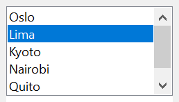
ListBoxW1.AddItem "Oslo"
ListBoxW1.AddItem "Lima"
ListBoxW1.AddItem "Kyoto"
ListBoxW1.ListIndex = 1
Debug.Print ListBoxW1.Text; ListBoxW1.ListCount
' Output:
' Lima 3
The control stands in place of the ListBox of VB6. It keeps its text in Unicode, and adds option buttons, an insertion mark between items for drag and drop, searching (FindItem, SelectItem), hit testing, the collections SelectedIndices and CheckedIndices, dropped files, and items that the program draws.
Of the common members, the control has every member under Name and place, Window handles, Font and visual styles, Mouse, Keyboard and focus, Dragging the control, OLE drag and drop and Right-to-left but RightToLeftLayout. Its Click has a meaning of its own, and its mouse events give the position in twips.
- The list
- Selecting one item
- Selecting several items
- Check boxes and option buttons
- Columns and scrolling
- Dragging items
- Drawing the items
- Properties
- Methods
- Events
- LstStyleConstants
- LstDrawModeConstants
- See Also
The list
AddItem adds an item at the end of the list or at an index, RemoveItem removes one and Clear removes all. ListCount is the number of items, and List is the text of one, by its index from 0. Each item also holds a number of the program’s own, ItemData, which stays with the item when others are added or removed.
NewIndex is the index that the last AddItem gave its item. With Sorted set to True, AddItem without an index puts each item in alphabetical order, without regard to case, so NewIndex is the way to find it again.
With ListBoxW1
    .Sorted = True
    .AddItem "pear"
    .AddItem "fig"
    .AddItem "apple"
    .ItemData(.NewIndex) = 500
    Debug.Print .List(0); " "; .List(1); " "; .List(2); .NewIndex; .ItemData(0)
End With
' Output:
' apple fig pear 0  500
To add many items quickly, set Redraw to False, add them, and set it to True again.
A change of AllowSelection, DisableNoScroll, MultiColumn, MultiSelect, Sorted or UseTabStops at run time makes the control’s window again. The items, their ItemData and the selection are kept, but hWnd is a new handle, and the control raises Click once more when an item is selected.
Selecting one item
With MultiSelect at vbMultiSelectNone, its default, one item at most is selected. ListIndex is its index, or -1, and Text is its text.
A program selects an item by its index with ListIndex, by its text with Text, or with Selected. Each raises Click when the selection changes, as the user’s own choice does. A Text that no item has removes the selection.
With ListBoxW1
    .AddItem "red"
    .AddItem "green"
    .AddItem "blue"
    .ListIndex = 1
    Debug.Print .Text; .ListIndex; .SelCount
    .Text = "BLUE"                       ' case does not count
    Debug.Print .Text; .ListIndex
    .Text = "mauve"
    Debug.Print "["; .Text; "]"; .ListIndex; .SelCount
End With
' Output:
' green 1  1
' blue 2
' []-1  0
Selecting several items
With MultiSelect at vbMultiSelectSimple a click or the Spacebar selects an item or removes its selection. With vbMultiSelectExtended the user selects a range with the Shift key and single items with the Ctrl key, as in Windows Explorer.
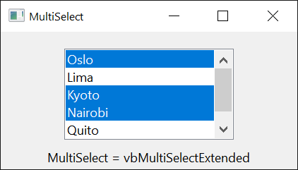
Selected says whether an item is selected, and selects it or removes its selection. SelCount is the number of selected items, SelectedIndices returns their indexes, and SetSelRange selects a run of items in a single call. In such a list ListIndex is not the selection: it is the item with the focus rectangle, and an assignment moves the rectangle without selecting anything. Text is the text of that item.
Dim Index As Variant
With ListBoxW1
    .Selected(0) = True
    .Selected(2) = True
    For Each Index In .SelectedIndices
        Debug.Print .List(Index)
    Next
End With
Check boxes and option buttons
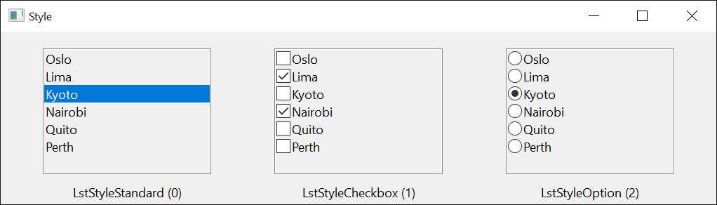
Style, set at design time, gives each item a check box (LstStyleCheckbox) or an option button (LstStyleOption), at the left of its text. The user checks an item with a click on its box, a click on the selected item, or the Spacebar. With check boxes any number of items can be checked. With option buttons one item at most is checked, and checking another clears it.
ItemChecked says whether an item is checked and checks it, CheckedIndices returns the indexes of the checked items, and OptionIndex is the checked item of an option list. Each change, by the user or by the program, raises ItemBeforeCheck, whose handler can refuse it, and then ItemCheck.
Private Sub ListBoxW1_ItemBeforeCheck(ByVal Item As Long, Cancel As Boolean)
    If ListBoxW1.List(Item) = "Required" Then Cancel = True     ' this item keeps its state
End Sub

Private Sub ListBoxW1_ItemCheck(ByVal Item As Long)
    Debug.Print ListBoxW1.List(Item); " is now "; IIf(ListBoxW1.ItemChecked(Item), "checked", "clear")
End Sub
Such a list selects one item at a time: MultiSelect stays vbMultiSelectNone, and DrawMode stays LstDrawModeNormal.
Columns and scrolling
A list in one column scrolls up and down. With MultiColumn set to True the items fill the control’s height, go on in a next column, and the list scrolls sideways by columns; SetColumnWidth sets the width of the columns and ItemsPerColumn returns how many items one holds.
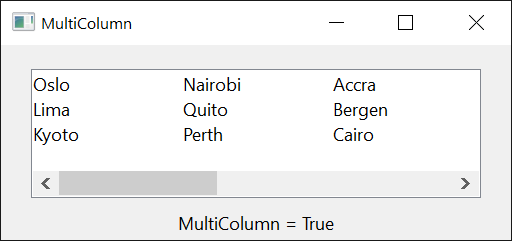
TopIndex is the first item shown, and the control raises Scroll when it changes. A list in one column whose items are wider than the control gets a horizontal scroll bar from HorizontalExtent.
Dragging items
With OLEDragMode set to vbOLEDragAutomatic, the user drags the selected items out of the list as text. While a drag is going on, OLEDraggedItem is the item it began on.
A list that takes items shows where a drop would put them with an insertion mark, a line between two items. In OLEDragOver the handler asks HitTestInsertMark for the item under the pointer and sets InsertMark; in OLEDragDrop it adds the item there and removes the mark. The list scrolls by itself while the pointer is near its top or bottom edge, unless OLEDragDropScroll is False.
Private Sub ListBoxW1_OLEDragOver(Data As DataObject, Effect As Long, Button As Integer, Shift As Integer, X As Single, Y As Single, State As Integer)
    Dim After As Boolean, Index As Long
    If State = vbLeave Then
        ListBoxW1.InsertMark = -1
    Else
        Index = ListBoxW1.HitTestInsertMark(X, Y, After)
        ListBoxW1.InsertMark(After) = Index
    End If
End Sub

Private Sub ListBoxW1_OLEDragDrop(Data As DataObject, Effect As Long, Button As Integer, Shift As Integer, X As Single, Y As Single)
    Dim After As Boolean, Index As Long
    Index = ListBoxW1.InsertMark(After)
    ListBoxW1.InsertMark = -1
    If Index < 0 Then
        ListBoxW1.AddItem Data.GetData(vbCFText)
    Else
        ListBoxW1.AddItem Data.GetData(vbCFText), IIf(After, Index + 1, Index)
    End If
End Sub
Drawing the items
With DrawMode set at design time to LstDrawModeOwnerDrawFixed or LstDrawModeOwnerDrawVariable, the control draws no item: it raises ItemDraw for each item to show, and the handler draws into the device context it is given. With LstDrawModeOwnerDrawVariable the items can differ in height, and the control first raises ItemMeasure for each item as it is added. The items still hold their texts. Drawing the items of ComboBoxW has a handler; one for this control differs in the control’s name only.
Properties
AllowDropFiles
Whether the control takes files that the user drags onto it from Windows Explorer, and raises DropFiles. Boolean. Default: False. It has an effect while OLEDropMode is OLEDropModeNone.
AllowSelection
Whether the list shows a selection. Boolean. Default: True. With False the user can look at the items and scroll, and a click selects nothing.
AnchorIndex
The item from which the user’s next selection with the Shift key extends, in a list that selects several items. Long. A value less than -1, or one that is not an item, raises run-time error 380.
BackColor
The background color of the list. OLE_COLOR. A new control has vbWindowBackground.
BorderStyle
The border of the control. A member of CCBorderStyleConstants. Default: CCBorderStyleSunken. Another value raises run-time error 380.
DisableNoScroll
Whether the list shows a disabled scroll bar when all its items fit. Boolean. Default: False, with which the list has a scroll bar only when it needs one.
DrawMode
Whether the control or the program draws the items. A member of LstDrawModeConstants. Default: LstDrawModeNormal. See Drawing the items.
It is set at design time. At run time an assignment raises run-time error 382, and a value that is not a member raises 380.
ForeColor
The color of the items’ text. OLE_COLOR.
HorizontalExtent
The width over which a list in one column can be scrolled sideways, in the scale units of the control’s container. Single. Default: 0. The list has a horizontal scroll bar while this is greater than its own width. GetIdealHorizontalExtent returns the value that fits the items. A negative value raises run-time error 380.
InsertMark
The item at which the insertion mark is drawn, or -1 for no mark. Long. Default: -1. See Dragging items.
Syntax: object.InsertMark[( After )] [ = value ]
- After
- optional A Boolean variable. In an assignment, True draws the mark below the item and False, the default, above it. When the property is read, the variable receives which of the two the mark is.
A value that is not an item raises run-time error 381. The mark goes when RemoveItem leaves no item at its index.
InsertMarkColor
The color of the insertion mark. OLE_COLOR. Default: black.
IntegralHeight
Whether the list shows whole items only. Boolean. Default: True, with which the control makes itself a little lower so that its last item is not cut. It is always False with LstDrawModeOwnerDrawVariable.
It is set at design time: an assignment at run time raises run-time error 382.
ItemChecked
Whether an item is checked, in a list with check boxes or option buttons. Boolean.
Syntax: object.ItemChecked( Index ) [ = value ]
An assignment that changes the item raises ItemBeforeCheck and, unless its handler refuses, ItemCheck. In a list with option buttons, checking an item clears the one checked before, and False for the checked item leaves none checked.
In a LstStyleStandard list the property is always False, and an assignment does nothing. An Index that is not an item raises run-time error 381.
ItemData
A number of the program’s own that an item holds, such as the key of the record the item stands for. LongPtr. A new item has 0.
Syntax: object.ItemData( Index ) [ = value ]
An Index that is not an item raises run-time error 381.
ItemHeight
The height of an item, in the scale units of the control’s container. Single.
Syntax: object.ItemHeight[( Index )] [ = value ]
- Index
- optional The item, with LstDrawModeOwnerDrawVariable, where each item has its own height. With the other draw modes all items have one height, and an Index other than 0 raises run-time error 5.
A negative height raises run-time error 380.
List
The text of an item. String.
Syntax: object.List( Index ) [ = value ]
An assignment replaces the item’s text and keeps its ItemData and the selection. When the item is the selected one, the control raises Click. An Index that is not an item raises run-time error 5.
ListCount
The number of items in the list. Long, read-only.
ListIndex
The index of the selected item, or -1 when no item is selected. Long. Default: -1. In a list that selects several items it is the index of the item with the focus rectangle.
An assignment selects the item, or moves the focus rectangle, and raises Click unless the value is the one the property has. -1 removes the selection. A value that is not an item raises run-time error 380.
In a list that selects several items, -1 leaves the focus rectangle and the selection as they are, and raises Click.
MultiColumn
Whether the items are laid out in columns and the list scrolls sideways. Boolean. Default: False. See Columns and scrolling. With LstDrawModeOwnerDrawVariable an assignment of True raises run-time error 383.
MultiSelect
Whether the user can select several items, and how. A member of MultiSelectConstants. Default: vbMultiSelectNone. See Selecting several items. Another value raises run-time error 380, and a value other than vbMultiSelectNone raises 383 in a list with check boxes or option buttons.
It can be assigned at run time, and the list keeps its items and its selected item. An empty list accepts it too, and a list that selects several items accepts an assignment to Sorted while it is empty.
NewIndex
The index of the item that AddItem added last. Long, read-only. It is -1 when no item was added, and after RemoveItem or Clear.
OLEDragDropScroll
Whether the list scrolls by itself while data is dragged over it near an edge. Boolean. Default: True. It has an effect while OLEDropMode is OLEDropModeManual.
OLEDragMode
Whether the user can drag items out of the list. A member of OLEDragConstants. Default: vbOLEDragManual, with which only OLEDrag starts a drag. With vbOLEDragAutomatic a drag that begins on a selected item carries the texts of the selected items, one to a line, to copy. Another value raises run-time error 380.
OLEDraggedItem
The index of the item on which the drag that is going on began. Long, read-only. It is -1 while no drag is going on.
OptionIndex
The index of the checked item of a LstStyleOption list, or -1 when none is checked. Long. An assignment checks the item as ItemChecked does, and -1 clears the checked one. With another style it is -1 and an assignment does nothing. A value that is not an item raises run-time error 381.
Redraw
Whether the control draws itself when its items change. Boolean. Default: True. Setting it to True again draws the control.
ScrollTrack
Whether the list scrolls while the user drags the scroll box of a scroll bar. Boolean. Default: True. With False the list scrolls when the user releases the scroll box.
SelCount
The number of selected items. Long, read-only.
Selected
Whether an item is selected. Boolean.
Syntax: object.Selected( Index ) [ = value ]
An assignment selects the item or removes its selection, and raises Click when that changes the selection. In a list that selects one item, True takes the selection from the item that had it. An Index that is not an item raises run-time error 381.
Sorted
Whether AddItem without an index puts each new item in alphabetical order. Boolean. Default: False. An AddItem with an index puts the item at that index all the same.
Note 1.8.141.0
An assignment of True at run time does not sort the items already in the list, and the items added afterward are placed as if the list were sorted. Set Sorted before the first item is added.
Style
Whether the items have check boxes or option buttons. A member of LstStyleConstants. Default: LstStyleStandard. See Check boxes and option buttons.
It is set at design time: an assignment at run time raises run-time error 382.
Text
The text of the selected item, or an empty string when none is selected. String. It is the control’s default property. In a list that selects several items it is the text of the item with the focus rectangle.
An assignment selects the item whose whole text is the value, without regard to case. When no item has it, the selection is removed; in a list that selects several items the assignment changes nothing.
TopIndex
The index of the first item shown. Long. An assignment scrolls the list. A negative value raises run-time error 380.
UseTabStops
Whether a tab character in an item’s text moves the text after it to the next tab stop, which lines the items up in columns. Boolean. Default: True.
Methods
AddItem
Adds an item to the list, and sets NewIndex to its index.
Syntax: object.AddItem Item [, Index ]
- Item
- required A String: the text of the item.
- Index
- optional The index the item gets; the items from there on move down by one. Without it the item goes to the end of the list, or to its place in a Sorted list.
An Index that is negative or greater than ListCount raises run-time error 5.
CheckedIndices
Returns a Collection of the indexes of the checked items, in rising order. It is empty in a LstStyleStandard list.
Syntax: object.CheckedIndices
Clear
Removes every item. It raises no event.
Syntax: object.Clear
FindItem
Returns the index of the first item that has a text, or -1 when there is none. The search does not regard case.
Syntax: object.FindItem( Text [, Index [, Partial ] ] )
- Text
- required A String: the text to look for.
- Index
- optional A Long: the item after which the search starts. The search goes to the end of the list and on from its top, so this item is the last one looked at. The default, -1, searches from the top. A value that is not an item raises run-time error 381.
- Partial
- optional A Boolean: True finds an item that begins with Text, False (the default) one whose whole text is Text.
With ListBoxW1
    .AddItem "red"
    .AddItem "green"
    .AddItem "blue"
    Debug.Print .FindItem("GREEN"); .FindItem("gr"); .FindItem("gr", , True)
End With
' Output:
'  1 -1  1
GetIdealHorizontalExtent
Returns the HorizontalExtent with which the widest item can be scrolled into view, as a Single in the scale units of the control’s container. It returns 0 for an empty list.
Syntax: object.GetIdealHorizontalExtent
HitTest
Returns the index of the item at a position, or -1 when no item is there.
Syntax: object.HitTest( X, Y )
- X, Y
- required The position as two Single values, measured from the list’s top left corner in the scale units of the control’s container, as the OLE drag-and-drop events give it.
Warning 1.8.141.0
In an empty list the method returns 0, not -1, for a position where the first item would be.
HitTestInsertMark
Returns the index of the item at a position, as HitTest does, and says in which half of the item the position is.
Syntax: object.HitTestInsertMark( X, Y [, After ] )
- X, Y
- required The position, as for HitTest.
- After
- optional A Boolean variable that receives True when the position is in the lower half of the item, where an insertion mark belongs below it.
ItemsPerColumn
Returns the number of items that one column of a MultiColumn list holds, as a Long.
Syntax: object.ItemsPerColumn
RemoveItem
Removes an item from the list, and sets NewIndex to -1. Removing the selected item leaves no item selected and raises no event.
Syntax: object.RemoveItem Index
- Index
- required A Long: the item to remove. A value that is not an item raises run-time error 5.
SelectedIndices
Returns a Collection of the indexes of the selected items, in rising order.
Syntax: object.SelectedIndices
SelectItem
Selects the first item that begins with a text, and returns its index. When no item does, it returns -1 and the selection stays. The search does not regard case.
Syntax: object.SelectItem( Text [, Index ] )
- Text
- required A String: the beginning of the item’s text.
- Index
- optional A Long: the item after which the search starts, as in FindItem.
Unlike an assignment to ListIndex, the method raises no Click.
SetColumnWidth
Sets the width of the columns of a MultiColumn list.
Syntax: object.SetColumnWidth Value
- Value
- required A Single: the width in the scale units of the control’s container. A value that is not greater than 0 raises run-time error 380.
SetSelRange
Selects a run of items, or removes their selection, in a list that selects several items.
Syntax: object.SetSelRange StartIndex, EndIndex
- StartIndex, EndIndex
- required Two Long indexes. When StartIndex is less than EndIndex, the items from the one to the other are selected as well as those selected already. When it is not less, as when the two are the same, the selection is removed from those items.
The method raises Click when the number of selected items changes. In a list that selects one item it selects StartIndex. An index that is not an item raises run-time error 381.
Events
Click
Raised when the user selects an item, with the mouse or the keyboard, and when ListIndex, Selected, SetSelRange or Text changes the selection. A mouse click on the empty part of the list raises no Click.
Syntax: object_Click( )
ContextMenu
Raised when the user asks for the control’s shortcut menu, with the right mouse button or with Shift+F10.
Syntax: object_ContextMenu( ByVal X As Single, ByVal Y As Single )
- X, Y
- The position of the pointer, measured from the list’s top left corner in the scale units of the control’s container. Both are -1 when the user asked with the keyboard.
DropFiles
Raised when the user drops files on the control, while AllowDropFiles is True.
Syntax: object_DropFiles( FileList As Variant, ByVal X As Single, ByVal Y As Single )
- FileList
- An array of String, from index 0: the full path of each file.
- X, Y
- The position of the drop, measured from the list’s top left corner in the scale units of the control’s container.
ItemBeforeCheck
Raised when an item of a list with check boxes or option buttons is about to be checked or cleared.
Syntax: object_ItemBeforeCheck( ByVal Item As Long, Cancel As Boolean )
- Item
- The index of the item.
- Cancel
- False when the event is raised. A handler that sets it to True leaves the item as it is, and ItemCheck is not raised.
ItemCheck
Raised when an item of a list with check boxes or option buttons has been checked or cleared.
Syntax: object_ItemCheck( ByVal Item As Long )
- Item
- The index of the item. In a list with option buttons it is the item now checked; no event is raised for the item that lost its check.
ItemDraw
Raised when an item is to be drawn, while DrawMode is not LstDrawModeNormal. See Drawing the items.
Syntax: object_ItemDraw( ByVal Item As Long, ByVal ItemAction As Long, ByVal ItemState As Long, ByVal hDC As Long, ByVal Left As Long, ByVal Top As Long, ByVal Right As Long, ByVal Bottom As Long )
- Item
- The index of the item, or -1 when the list is empty and only the focus is to be drawn.
- ItemAction
- What to draw, a sum of 1 (the whole item), 2 (the item was selected or the selection was removed) and 4 (the item received or lost the focus).
- ItemState
- The state of the item, a sum of 1 (selected), 4 (disabled) and &H10 (it has the focus).
- hDC
- The device context to draw into. In a 64-bit program it is the low 32 bits of the handle, which is all that a device context’s handle uses.
- Left, Top, Right, Bottom
- The rectangle of the item, in pixels.
ItemMeasure
Raised once for each item added, while DrawMode is LstDrawModeOwnerDrawVariable, to ask for the item’s height.
Syntax: object_ItemMeasure( ByVal Item As Long, ItemHeight As Long )
- Item
- The index of the item.
- ItemHeight
- The height of the item in pixels. The handler sets it.
MouseDown, MouseMove, MouseUp
As the common events of these names, but X and Y are in twips, whatever the scale units of the control’s container, and are measured from the top left corner of the list.
Scroll
Raised when the list has scrolled, so that another item is the first one shown.
Syntax: object_Scroll( )
LstStyleConstants
The values of Style.
| Member | Value | Description |
|---|---|---|
| LstStyleStandard | 0 | Items of text alone. |
| LstStyleCheckbox | 1 | Each item has a check box. |
| LstStyleOption | 2 | Each item has an option button, and one item at most is checked. |
LstDrawModeConstants
The values of DrawMode.
| Member | Value | Description |
|---|---|---|
| LstDrawModeNormal | 0 | The control draws the items. |
| LstDrawModeOwnerDrawFixed | 1 | The program draws the items, which all have one height. |
| LstDrawModeOwnerDrawVariable | 2 | The program draws the items and gives each its height. |
See Also
- Common members – the members this control shares with the package’s other controls
- VListBox – the same control without a list of its own, for a very long list
- ComboBoxW – a text box with a drop-down list
- ListBox – the control of the VB package that this one stands in place of