DTPicker class
A DTPicker shows one date, one time, or both, in a box of fields. The user changes a field with the keyboard or the mouse and picks a date from a drop-down calendar, or from a pair of arrow buttons that stand in place of the calendar.
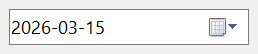
DTPicker1.Value = DateSerial(2026, 3, 15) + TimeSerial(10, 20, 30)
Debug.Print Format$(DTPicker1.Value, "yyyy-mm-dd hh:nn:ss")
DTPicker1.Month = 7
DTPicker1.Day = 31
Debug.Print Format$(DTPicker1.Value, "yyyy-mm-dd hh:nn:ss")
' Output:
'  2026-03-15 10:20:30
'  2026-07-31 10:20:30
The control stands in place of the DTPicker of the Microsoft common controls (MSCOMCT2.OCX). The WinNativeCommonCtls package has a DTPicker too; this one adds AllowUserInput with its three events, CalendarAlignment, CalendarFont, CalendarDayState, CalendarUseShortestDayNames, DroppedDown, Selected, GetIdealSize and the context menu events.
Of the common members, the control has those under Name and place, Window handles, Font and visual styles, Mouse but its DblClick event, Keyboard and focus, Dragging the control, OLE drag and drop and Right-to-left, RightToLeftLayout included. Its hWnd is the window of the date picker of Windows.
- The date and the time
- The range of dates
- No date: the check box
- Custom formats
- Typing a date
- The calendar
- Properties
- Methods
- Events
- DtpFormatConstants
- See Also
The date and the time
Value is a Variant that holds a Date, with the time of day, or Null while the control has no date. A new control holds the date of the day it is made. Assigning a number gives the date with that serial number, as CDate does, and assigning Empty is assigning Null.
The box shows the date or the time by Format: a long or a short date, a time, or a custom format.
Value keeps the seconds of a time, and the control shows them if its format does. A value that is neither a date nor a number raises run-time error 380.
The parts of the date are also properties: Year, Month, Day, Hour, Minute, Second and Week. Each one reads the part of Value, and an assignment to it changes that part and nothing else, as an assignment to Value does. DayCount and DayOfWeek read the length of the month and the weekday.
A part outside its range raises run-time error 380: a Month from 1 to 12, a Day from 1 to the DayCount of the month, an Hour from 0 to 23, a Minute and a Second from 0 to 59, and a Week from 1 to 53.
The range of dates
MinDate and MaxDate limit the dates the control accepts, both from 1 January 1900 to the end of 31 December 9999, which is the default range. They limit what the user can pick and what a program assigns.
A Value outside the range raises run-time error 35773 and changes nothing. A MinDate after MaxDate raises 35775, a MaxDate before MinDate raises 35774, and a date before 1900 raises 380.
On Error Resume Next
DTPicker1.MinDate = DateSerial(2026, 1, 1)
DTPicker1.MaxDate = DateSerial(2026, 12, 31)
DTPicker1.Value = DateSerial(2027, 1, 1)
Debug.Print Err.Number
Err.Clear
DTPicker1.MaxDate = DateSerial(2025, 1, 1)
Debug.Print Err.Number
' Output:
'  35773
'  35774
A new MinDate after the current date, or a new MaxDate before it, moves Value to that limit. The move raises no Change.
No date: the check box
With CheckBox set to True the control shows a check box at the left of the date. While the box is not checked the control has no date: Value is Null and Selected is False. The user checks the box with the mouse or the space bar. A program unselects the date by assigning Null to Value, or False to Selected, and selects it again with Selected set to True, which brings back the date the control held before.
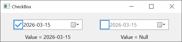
Assigning Null to a control without a check box raises run-time error 35787. Setting CheckBox to False while no date is selected selects the date held before.
DTPicker1.CheckBox = True
DTPicker1.Value = DateSerial(2026, 3, 15)
DTPicker1.Value = Null
Debug.Print DTPicker1.Selected, IsNull(DTPicker1.Value)
DTPicker1.Selected = True
Debug.Print DTPicker1.Selected, Format$(DTPicker1.Value, "yyyy-mm-dd")
' Output:
'  False         True
'  True          2026-03-15
Custom formats
With Format set to DtpFormatCustom, CustomFormat says what the box shows. Each of these codes shows a field, and the user changes the field with the arrow keys.
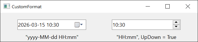
| Code | Shows |
|---|---|
d, dd | the day of the month, without and with a leading zero |
ddd, dddd | the name of the weekday, short and long |
M, MM | the month number, without and with a leading zero |
MMM, MMMM | the name of the month, short and long |
yy, yyyy | the year, with two and with four digits |
h, hh | the hour from 1 to 12, without and with a leading zero |
H, HH | the hour from 0 to 23, without and with a leading zero |
m, mm | the minute, without and with a leading zero |
s, ss | the second, without and with a leading zero |
t, tt | the first letter of the AM or PM sign, and the whole sign |
X, XX, … | a callback field, described below |
Any other text goes between single quotes, and a doubled quote is a quote. The names of weekdays and months, and the AM and PM signs, are those of the user’s language.
The text of the window of hWnd is the text the box shows:
Dim Shown As String, N As Long
Shown = String$(100, vbNullChar)
DTPicker1.Value = DateSerial(2026, 3, 5) + TimeSerial(14, 7, 0)
DTPicker1.Format = DtpFormatCustom
DTPicker1.CustomFormat = "yyyy-MM-dd HH:mm"
N = DtpGetWindowText(DTPicker1.hWnd, StrPtr(Shown), 100)
Debug.Print Left$(Shown, N)
DTPicker1.CustomFormat = "'Day 'd' of month 'M"
N = DtpGetWindowText(DTPicker1.hWnd, StrPtr(Shown), 100)
Debug.Print Left$(Shown, N)
' Output:
'  2026-03-05 14:07
'  Day 5 of month 3
A run of the letter X that is not between quotes is a field whose text the program supplies. The control raises FormatSize to learn how many characters the field needs, FormatString to learn its text, and CallbackKeyDown when the user presses a key in it.
FormatSize is raised when CustomFormat is set to a format with a callback field, with the run of X as CallbackField.
Private Sub DTPicker1_FormatSize(ByVal CallbackField As String, Size As Integer)
    Size = 6                                   ' room for "Spring"
End Sub

Private Sub DTPicker1_FormatString(ByVal CallbackField As String, FormattedString As String)
    FormattedString = "Spring"
End Sub
Typing a date
With AllowUserInput set to True the user can type the whole date into the box, after pressing F2 or clicking inside it. The control raises BeforeUserInput when typing starts, and when the user finishes it raises ParseUserInput with the typed text, so that the program turns the text into a date. AfterUserInput follows when the typing is over, whether the user finished or cancelled it.
Private Sub DTPicker1_ParseUserInput(ByVal Text As String, ParseDate As Variant)
    If Text = "today" Then
        ParseDate = Date
    ElseIf IsDate(Text) Then
        ParseDate = CDate(Text)
    Else
        ParseDate = Null                       ' only with CheckBox = True
    End If
End Sub
The calendar
The calendar drops down from a button at the right of the box, or when the user presses Alt+Down. DropDown is raised when it is about to open and CloseUp when it has closed. While it is open, DroppedDown is True and hWndCalendar is its handle. With UpDown set to True the control has a pair of arrow buttons in place of the calendar, and the time format has none either way.
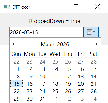
The calendar has its own font, CalendarFont, its own colors, and the options of the Calendar properties: CalendarShowToday and CalendarShowTodayCircle for the day of the program’s run, CalendarShowWeekNumbers, CalendarShowTrailingDates, CalendarUseShortestDayNames and StartOfWeek.
The program opens the calendar by setting DroppedDown to True and closes it by setting it to False. Each raises its event.
With CalendarDayState set to True, the calendar raises CalendarGetDayBold before it shows a month, and draws in bold the days the program marks:
Private Sub DTPicker1_CalendarGetDayBold(ByVal StartDate As Date, ByVal Count As Long, State() As Boolean)
    Dim I As Long
    For I = 1 To Count
        If Weekday(StartDate + I - 1) = vbMonday Then State(I) = True
    Next
End Sub
Properties
AllowUserInput
Whether the user can type a date into the box. Boolean. Default: False. See Typing a date. A change makes the control draw again from a new window.
CalendarAlignment
Which edge of the control the calendar lines up with when it drops down. A member of CCLeftRightAlignmentConstants. Default: CCLeftRightAlignmentLeft.
Any other value raises run-time error 380. When RightToLeft and RightToLeftLayout are both True the control sets this to CCLeftRightAlignmentRight itself.
CalendarBackColor
The background color of the days in the calendar. OLE_COLOR. Default: vbWindowBackground. Windows ignores it while the calendar is drawn with visual styles, so it shows with VisualStyles set to False.
CalendarDayState
Whether the calendar asks the program which days to draw in bold. Boolean. Default: False. With True the calendar raises CalendarGetDayBold.
CalendarFont
The font of the calendar. A StdFont object. A new control has the font of its container. Assigning Nothing gives the container’s font again.
CalendarForeColor
The color of the text of the days in the calendar. OLE_COLOR. Default: vbButtonText. It shows with visual styles off, as CalendarBackColor does.
CalendarShowToday
Whether the calendar shows a line with the current date at its bottom. Boolean. Default: True.
CalendarShowTodayCircle
Whether the calendar draws a circle round the current date. Boolean. Default: True.
CalendarShowTrailingDates
Whether the calendar shows the days of the months before and after the one it displays, in the cells that month leaves free. Boolean. Default: True.
CalendarShowWeekNumbers
Whether the calendar shows the week numbers at the left of the weeks. Boolean. Default: False.
CalendarTitleBackColor
The background color of the calendar’s title, with the month and the year. OLE_COLOR. Default: vbActiveTitleBar. It shows with visual styles off.
CalendarTitleForeColor
The color of the text of the calendar’s title. OLE_COLOR. Default: vbActiveTitleBarText. It shows with visual styles off.
CalendarTrailingForeColor
The color of the days of the neighbouring months. OLE_COLOR. Default: vbGrayText. It shows with visual styles off.
CalendarUseShortestDayNames
Whether the calendar writes the names of the weekdays with the shortest form the user’s language has, one or two letters, in place of the short form. Boolean. Default: False.
CheckBox
Whether the control shows a check box at the left of the date, so that it can have no date. Boolean. Default: False. See No date: the check box. A change makes the control draw again from a new window, and keeps the value and the selection.
CustomFormat
The format of the box when Format is DtpFormatCustom. String. Default: empty. See Custom formats.
Day
The day of the month of Value. Variant, a number from 1 to DayCount; Null while no date is selected. An assignment changes the day, and a number outside the month raises run-time error 380.
DayCount
The number of days in the month of Value. Variant, read-only.
DayOfWeek
The day of the week of Value, as a number from 0 for Sunday to 6 for Saturday. Integer, read-only.
Reading it while no date is selected raises run-time error 94.
DroppedDown
Whether the calendar is open. Boolean. Setting it to True opens the calendar as Alt+Down does, and False closes it. A control with UpDown set to True has no calendar and stays False.
Format
What the box shows. A member of DtpFormatConstants. Default: DtpFormatShortDate.
Any other value raises run-time error 380. A change makes the control draw again from a new window, and keeps the value and the selection.
Hour
The hour of Value, from 0 to 23. Variant; Null while no date is selected.
hWndCalendar
The handle of the window of the calendar while it is open, and 0 otherwise. LongPtr, read-only.
hWndUpDown
The handle of the window of the arrow buttons when UpDown is True, and 0 otherwise. LongPtr, read-only.
MaxDate
The last date the control accepts. Date. Default: 31 December 9999. See The range of dates.
MinDate
The first date the control accepts. Date. Default: 1 January 1900. See The range of dates.
Minute
The minute of Value, from 0 to 59. Variant; Null while no date is selected.
Month
The month of Value, from 1 to 12. Variant; Null while no date is selected.
Second
The second of Value, from 0 to 59. Variant; Null while no date is selected.
Selected
Whether the control has a date. Boolean. It is always True for a control without CheckBox. With a check box it is the state of the box: setting it to False assigns Null to Value, and setting it to True brings back the date held before.
StartOfWeek
The day shown in the leftmost column of the calendar. Integer: 0 for the first day of the week of the user’s language (the default), or 1 for Monday to 7 for Sunday.
Any other value raises run-time error 380.
While the calendar is open it reads the day the calendar shows, from 1 to 7, and otherwise it reads the setting. The setting is applied when the calendar opens.
SystemStartOfWeek
The first day of the week of the user’s language, from 1 for Monday to 7 for Sunday. Integer, read-only.
UpDown
Whether a pair of arrow buttons, which change the selected field, stands in place of the drop-down calendar. Boolean. Default: False. It has no effect with the time format. A change makes the control draw again from a new window.
Value
The date and the time. Variant: a Date, or Null while no date is selected. It is the control’s default property. See The date and the time, The range of dates and No date: the check box.
A change raises Change.
Week
The week of the year of Value, from 1 to 53, counted as StartOfWeek says, with the first week the one that has at least four days of the new year. Variant; Null while no date is selected. An assignment moves Value by the number of weeks between the two numbers, and a number outside 1 to 53 raises run-time error 380.
Year
The year of Value. Variant; Null while no date is selected. Assigning a value that is not a number raises run-time error 380.
Methods
GetIdealSize
Gives the width and the height the control needs to show its text.
Syntax: object.GetIdealSize Width, Height
- Width, Height
- required Single variables that receive the size, in the scale units of the control’s container.
Events
AfterUserInput
Raised when the user has finished typing a date, or has cancelled it. See Typing a date.
Syntax: object_AfterUserInput( )
BeforeUserInput
Raised when the user starts typing a date, which needs AllowUserInput.
Syntax: object_BeforeUserInput( ByVal hWndEdit As LongPtr )
- hWndEdit
- The handle of the window of the box that takes the typing.
CalendarContextMenu
Raised when the user asks for the menu of the open calendar, with the right mouse button or with Shift+F10.
Syntax: object_CalendarContextMenu( Handled As Boolean, ByVal X As Single, ByVal Y As Single )
- Handled
- False when the event is raised. A handler that sets it to True keeps the control from going on with the request.
- X, Y
- The place of the click, measured from the top left corner of the calendar in the scale units of the control’s container. Both are -1 when the user asked with the keyboard.
CalendarGetDayBold
Raised when the calendar needs to know which days to draw in bold, with CalendarDayState set to True. See The calendar.
Syntax: object_CalendarGetDayBold( ByVal StartDate As Date, ByVal Count As Long, State() As Boolean )
- StartDate
- The first day the calendar shows.
- Count
- The number of days the calendar shows.
- State
- An array of Count elements, indexed from 1, one for each day from StartDate. A handler sets an element to True to draw that day in bold.
CallbackKeyDown
Raised when the user presses a key while a callback field has the focus.
Syntax: object_CallbackKeyDown( ByVal KeyCode As Integer, ByVal Shift As Integer, ByVal CallbackField As String, CallbackDate As Date )
- KeyCode, Shift
- The key, as the KeyDown event gives it.
- CallbackField
- The run of X that makes the field.
- CallbackDate
- The date of the control. A handler changes it to change the date.
Change
Raised when Value has changed, by an assignment or by the user, and when the user checks or unchecks the check box. A change of the seconds counts. Assigning the value the control already holds raises nothing.
Syntax: object_Change( )
CloseUp
Raised when the calendar has closed.
Syntax: object_CloseUp( )
ContextMenu
Raised when the user asks for the menu of the control, with the right mouse button or with Shift+F10.
Syntax: object_ContextMenu( Handled As Boolean, ByVal X As Single, ByVal Y As Single )
- Handled
- False when the event is raised. A handler that sets it to True keeps the control from going on with the request.
- X, Y
- The place of the click, measured from the top left corner of the control in the scale units of the control’s container. Both are -1 when the user asked with the keyboard.
DropDown
Raised when the calendar is about to open.
Syntax: object_DropDown( )
FormatSize
Raised when the control needs the greatest width of a callback field.
Syntax: object_FormatSize( ByVal CallbackField As String, Size As Integer )
- CallbackField
- The run of X that makes the field.
- Size
- The greatest number of characters the field will show. A handler sets it. A control that is given 0 uses 1.
FormatString
Raised when the control needs the text of a callback field.
Syntax: object_FormatString( ByVal CallbackField As String, FormattedString As String )
- CallbackField
- The run of X that makes the field.
- FormattedString
- The text to show, up to 63 characters. A handler sets it.
ParseUserInput
Raised when the user has finished typing a date, with AllowUserInput set to True. See Typing a date.
Syntax: object_ParseUserInput( ByVal Text As String, ParseDate As Variant )
- Text
- What the user typed.
- ParseDate
- The date of the control when the event is raised. A handler sets it to the date the text means: a Date, a number, or Null (or Empty) to select no date, which needs CheckBox. The date must be within MinDate and MaxDate.
DtpFormatConstants
The values of Format.
| Member | Value | Description |
|---|---|---|
| DtpFormatLongDate | 0 | The date in the long form of the user’s language, with the names of the weekday and of the month. |
| DtpFormatShortDate | 1 | The date in the short form of the user’s language, with numbers. |
| DtpFormatTime | 2 | The time of day, in the form of the user’s language. The control has no calendar and no arrow buttons. |
| DtpFormatCustom | 3 | The format of CustomFormat. |
See Also
- Common members – the members this control shares with the package’s other controls
- MonthView – a calendar that stays on the form
- DTPicker – the control of the same name in the WinNativeCommonCtls package