ComboBoxW class
A ComboBoxW is a text box joined to a list of text items: the user types a text or picks an item from the list, which drops down under the text box or stays open below it.
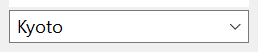
ComboBoxW1.AddItem "Oslo"
ComboBoxW1.AddItem "Lima"
ComboBoxW1.AddItem "Kyoto"
ComboBoxW1.ListIndex = 2
Debug.Print ComboBoxW1.Text; ComboBoxW1.ListCount
' Output:
' Kyoto 3
The control stands in place of the ComboBox of VB6. It keeps its text in Unicode, and adds a prompt in the empty text box (CueBanner), the size and the colors of the drop-down list, searching (FindItem, SelectItem, AutoSelect), upper or lower case, and items that the program draws.
Of the common members, the control has every member under Name and place, Window handles, Font and visual styles, Mouse, Keyboard and focus, Dragging the control, OLE drag and drop and Right-to-left but RightToLeftLayout. Its Click and DblClick have a meaning of their own, and its mouse events give the position in twips.
- The styles
- The list
- The selection and the text
- Finding an item
- The drop-down list
- Drawing the items
- Properties
- Methods
- Events
- CboStyleConstants
- CboCharacterCasingConstants
- CboDrawModeConstants
- See Also
The styles
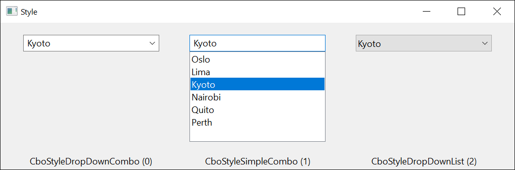
Style is set at design time and decides what the control is made of:
| Style | The control |
|---|---|
| CboStyleDropDownCombo | A text box with an arrow button. The list drops down when the user presses the button. The user types any text or picks an item. |
| CboStyleSimpleCombo | A text box with the list always open below it. The user types any text or picks an item. |
| CboStyleDropDownList | A field that shows the selected item, with an arrow button. The user picks an item and cannot type a text of their own. |
The first two have a text box, whose window is hWndEdit. The members that work on the text box, such as SelStart, Locked and MaxLength, do nothing useful on a CboStyleDropDownList control, which has none.
The list
AddItem adds an item at the end of the list or at an index, RemoveItem removes one and Clear removes all. ListCount is the number of items, and List is the text of one, by its index from 0. Each item also holds a number of the program’s own, ItemData, which stays with the item when others are added or removed.
NewIndex is the index that the last AddItem gave its item. With Sorted set to True, AddItem without an index puts each item in alphabetical order, without regard to case, so NewIndex is the way to find it again.
With ComboBoxW1
    .Sorted = True
    .AddItem "pear"
    .AddItem "fig"
    .AddItem "apple"
    .ItemData(.NewIndex) = 500
    Debug.Print .List(0); " "; .List(1); " "; .List(2); .NewIndex; .ItemData(0)
    .List(0) = "apricot"                 ' the item keeps its ItemData
    Debug.Print .List(0); .ItemData(0)
End With
' Output:
' apple fig pear 0  500
' apricot 500
To add many items quickly, set Redraw to False, add them, and set it to True again.
A change of Sorted, CharacterCasing or DisableNoScroll at run time makes the control’s window again. The items, their ItemData, the selection and the text are kept, but hWnd, hWndEdit and hWndList are new handles, and the control raises Click once more when an item is selected.
The selection and the text
ListIndex is the index of the selected item, or -1 when none is selected. Text is the text in the text box.
Selecting an item, by the user or by an assignment to ListIndex, puts the item’s text in the text box and raises Click, not Change. Typing in the text box, or assigning another text to Text, raises Change and leaves ListIndex as it was, so after such a change ListIndex can name an item whose text is not the one in the text box.
With ComboBoxW1
    .AddItem "red"
    .AddItem "green"
    .AddItem "blue"
    .ListIndex = 1
    Debug.Print .Text; .ListIndex
    .Text = "mauve"
    Debug.Print .Text; .ListIndex
    .ListIndex = -1
    Debug.Print "["; .Text; "]"; .ListIndex
End With
' Output:
' green 1
' mauve 1
' []-1
A program that reacts to both the typed text and the picked item handles both events:
Private Sub ComboBoxW1_Click()
    Debug.Print "picked item"; ComboBoxW1.ListIndex
End Sub

Private Sub ComboBoxW1_Change()
    Debug.Print "text is now "; ComboBoxW1.Text
End Sub
SelStart, SelLength and SelText are the selected part of the text in the text box, as on a text box.
Finding an item
FindItem returns the index of an item by its text, and SelectItem selects the first item that begins with a text. Neither regards case.
With ComboBoxW1
    .AddItem "red"
    .AddItem "green"
    .AddItem "blue"
    Debug.Print .FindItem("GREEN"); .FindItem("gr"); .FindItem("gr", , True)
    Debug.Print .SelectItem("bl"); .Text; .ListIndex
End With
' Output:
'  1 -1  1
'  2 blue 2
With AutoSelect set to True the control does the same for the user: as soon as the text typed is the whole text of an item, that item is selected and Click is raised before Change.
The drop-down list
DroppedDown says whether the list is open, and opens or closes it. The control raises DropDown before the list opens, which is the moment to fill a list that depends on something else, and CloseUp when it has closed.
Private Sub ComboBoxW1_DropDown()
    If ComboBoxW1.ListCount = 0 Then
        ComboBoxW1.AddItem "filled when first opened"
    End If
End Sub
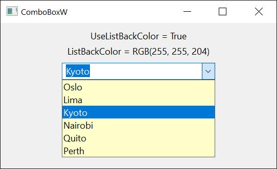
The list is as high as its items, up to MaxDropDownItems of them, unless the program sets DropDownHeight. It is as wide as the control unless DropDownWidth is wider. UseListBackColor and UseListForeColor give the list colors of its own, ListBackColor and ListForeColor.
Drawing the items
With DrawMode set at design time to CboDrawModeOwnerDrawFixed or CboDrawModeOwnerDrawVariable, the control draws no item: it raises ItemDraw for each item to show, in the list and in the field of a CboStyleDropDownList control, and the handler draws into the device context it is given. With CboDrawModeOwnerDrawVariable the items can differ in height, and the control first raises ItemMeasure for each item as it is added. The items still hold their texts.
Private Declare PtrSafe Function SetTextColor Lib "gdi32" (ByVal hDC As LongPtr, ByVal Color As Long) As Long
Private Declare PtrSafe Function SetBkMode Lib "gdi32" (ByVal hDC As LongPtr, ByVal Mode As Long) As Long
Private Declare PtrSafe Function TextOutW Lib "gdi32" (ByVal hDC As LongPtr, ByVal X As Long, ByVal Y As Long, ByVal Text As LongPtr, ByVal Length As Long) As Long

Private Sub ComboBoxW1_ItemDraw(ByVal Item As Long, ByVal ItemAction As Long, ByVal ItemState As Long, ByVal hDC As Long, ByVal Left As Long, ByVal Top As Long, ByVal Right As Long, ByVal Bottom As Long)
    If Item < 0 Then Exit Sub
    Dim Caption As String
    Caption = ComboBoxW1.List(Item)
    SetBkMode hDC, 1                                           ' transparent
    SetTextColor hDC, IIf((ItemState And 1) <> 0, vbRed, vbBlue)   ' 1: the item is selected
    TextOutW hDC, Left + 2, Top, StrPtr(Caption), Len(Caption)
End Sub
Properties
AlwaysFindExact
Whether the control looks in its list for whole texts only. Boolean. Default: False, with which the list, when it opens, selects the first item that begins with the text in the text box. With True it selects only an item whose whole text is that text.
AutoSelect
Whether the control selects an item as soon as the user has typed its whole text. Boolean. Default: False. See Finding an item. It has no effect on a CboStyleDropDownList control.
BackColor
The background color of the control. OLE_COLOR. A new control has vbWindowBackground.
CharacterCasing
Whether the control changes the case of its text. A member of CboCharacterCasingConstants. Default: CboCharacterCasingNormal. Another value raises run-time error 380.
With CboCharacterCasingUpper or CboCharacterCasingLower the control changes to that case the text in the text box and the items of the list, and from then on what the user types, a text assigned to Text and each item added. A return to CboCharacterCasingNormal does not give the texts their former case.
CueBanner
A prompt shown in grey in the text box while it is empty, such as Choose a city. String. Default: empty. It shows when the program has visual styles.
DisableNoScroll
Whether the list shows a disabled scroll bar when all its items fit. Boolean. Default: False, with which the list has a scroll bar only when it needs one.
DrawMode
Whether the control or the program draws the items. A member of CboDrawModeConstants. Default: CboDrawModeNormal. See Drawing the items.
It is set at design time. At run time an assignment raises run-time error 382, and a value that is not a member raises 380.
DropDownHeight
The height of the drop-down list, in the scale units of the control’s container. Single.
An assignment fixes the height: MaxDropDownItems no longer counts, until it is assigned again, and IntegralHeight becomes False. A value that is not greater than 0 raises run-time error 380. On a CboStyleSimpleCombo control the property raises run-time error 5.
DropDownWidth
The least width of the drop-down list, in the scale units of the control’s container. Single. The list is never narrower than the control. A negative value raises run-time error 380.
DroppedDown
Whether the drop-down list is open. Boolean. An assignment opens or closes it.
ExtendedUI
Whether the control uses the extended keyboard interface of the Windows combo box. Boolean. Default: False. With True the Down Arrow key opens the list, the F4 key does not, and the mouse wheel does not change the selection while the list is closed. It has no effect on a CboStyleSimpleCombo control.
FieldHeight
The height of the text box, or of the field of a CboStyleDropDownList control, in the scale units of the control’s container. Single. A negative value raises run-time error 380.
ForeColor
The color of the control’s text. OLE_COLOR.
HorizontalExtent
The width over which the list can be scrolled sideways, in the scale units of the control’s container. Single. Default: 0. The list has a horizontal scroll bar while this is greater than its own width. GetIdealHorizontalExtent returns the value that fits the items. A negative value raises run-time error 380.
hWndEdit
The handle of the text box inside the control. LongPtr, read-only. It is 0 on a CboStyleDropDownList control.
hWndList
The handle of the list. LongPtr, read-only.
IMEMode
The state of the Input Method Editor while the text box has the focus. A member of CCIMEModeConstants. Default: CCIMEModeNoControl. Another value raises run-time error 380.
IntegralHeight
Whether the list shows whole items only. Boolean. Default: True, with which the list makes itself a little lower so that its last item is not cut. It is always False in effect with CboDrawModeOwnerDrawVariable.
It is set at design time: an assignment at run time raises run-time error 382. An assignment to DropDownHeight makes it False.
ItemData
A number of the program’s own that an item holds, such as the key of the record the item stands for. LongPtr. A new item has 0.
Syntax: object.ItemData( Index ) [ = value ]
An Index that is not an item raises run-time error 381.
ItemHeight
The height of an item in the list, in the scale units of the control’s container. Single.
Syntax: object.ItemHeight[( Index )] [ = value ]
- Index
- optional The item, with CboDrawModeOwnerDrawVariable, where each item has its own height. With the other draw modes all items have one height, and an Index other than 0 raises run-time error 5.
A negative height or Index raises run-time error 380.
List
The text of an item. String.
Syntax: object.List( Index ) [ = value ]
An assignment replaces the item’s text and keeps its ItemData and the selection. When the item is the selected one, the text box receives the new text. An Index that is not an item raises run-time error 5.
ListBackColor
The background color of the drop-down list while UseListBackColor is True. OLE_COLOR. Default: vbWindowBackground.
ListCount
The number of items in the list. Long, read-only.
ListForeColor
The color of the text in the drop-down list while UseListForeColor is True. OLE_COLOR. Default: vbWindowText.
ListIndex
The index of the selected item, or -1 when no item is selected. Long. Default: -1.
An assignment selects the item, puts its text in the text box and raises Click, unless the item is selected already. -1 removes the selection and empties the text box. A value that is not an item raises run-time error 380.
Locked
Whether the user is kept from changing the text and the selection. Boolean. Default: False.
With True the text box takes no typing, and the list does not respond to the keyboard or to the mouse on its items. The program can still assign Text and ListIndex.
MaxDropDownItems
The greatest number of items that the drop-down list shows without scrolling. Integer. Default: 9.
A value less than 1 or greater than 30 raises run-time error 380.
MaxLength
The greatest number of characters that the user can type in the text box. Long. Default: 0. A negative value raises run-time error 380.
With 0 the user can type 255 characters, and a text that the program assigns to Text has no limit. With another value the limit is that number of characters for both: an assigned text loses what is beyond it.
NewIndex
The index of the item that AddItem added last. Long, read-only. It is -1 when no item was added, and after RemoveItem or Clear.
OLEDragMode
Whether the user can drag the selected text out of the text box. A member of OLEDragConstants. Default: vbOLEDragManual, with which only OLEDrag starts a drag. With vbOLEDragAutomatic a drag that begins on the selected text carries it as text, to copy or to move; the control removes text that was moved. Another value raises run-time error 380.
Redraw
Whether the control draws itself when its items change. Boolean. Default: True. Setting it to True again draws the control.
ScrollTrack
Whether the list scrolls while the user drags the scroll box of its scroll bar. Boolean. Default: True. With False the list scrolls when the user releases the scroll box.
SelLength
The number of characters selected in the text box. Long. A negative value raises run-time error 380.
SelStart
The position where the selection in the text box starts, counted from 0, or the position of the caret when nothing is selected. Long. An assignment puts the caret there and selects nothing. A negative value raises run-time error 380.
SelText
The selected text of the text box. String. An assignment replaces the selection, or inserts the text at the caret. On a CboStyleDropDownList control the property raises run-time error 380.
Sorted
Whether AddItem without an index puts each new item in alphabetical order. Boolean. Default: False. An AddItem with an index puts the item at that index all the same.
Note 1.8.141.0
An assignment of True at run time does not sort the items already in the list, and the items added afterward are placed as if the list were sorted. Set Sorted before the first item is added.
Style
What the control is made of. A member of CboStyleConstants. Default: CboStyleDropDownCombo. See The styles.
It is set at design time. At run time an assignment raises run-time error 382, and a value that is not a member raises 380.
Text
The text in the text box. String. A control newly drawn on a form has its own name.
On a CboStyleDropDownList control it is the text of the selected item, and an assignment selects the item that has this text; a text that no item has raises run-time error 383.
On the other styles an assignment that changes the text raises Change, and does not change ListIndex.
TopIndex
The index of the item at the top of the list. Long. An assignment scrolls the list. A value that is not an item raises run-time error 380.
UseListBackColor
Whether the drop-down list has ListBackColor as its background color. Boolean. Default: False.
UseListForeColor
Whether the drop-down list has ListForeColor as the color of its text. Boolean. Default: False.
Methods
AddItem
Adds an item to the list, and sets NewIndex to its index.
Syntax: object.AddItem Item [, Index ]
- Item
- required A String: the text of the item.
- Index
- optional The index the item gets; the items from there on move down by one. Without it the item goes to the end of the list, or to its place in a Sorted list.
An Index that is negative or greater than ListCount raises run-time error 5.
Clear
Removes every item, and empties the text box. It raises no event.
Syntax: object.Clear
FindItem
Returns the index of the first item that has a text, or -1 when there is none. The search does not regard case.
Syntax: object.FindItem( Text [, Index [, Partial ] ] )
- Text
- required A String: the text to look for.
- Index
- optional A Long: the item after which the search starts. The search goes to the end of the list and on from its top, so this item is the last one looked at. The default, -1, searches from the top. A value that is not an item raises run-time error 381.
- Partial
- optional A Boolean: True finds an item that begins with Text, False (the default) one whose whole text is Text.
GetIdealHorizontalExtent
Returns the HorizontalExtent with which the widest item can be scrolled into view, as a Single in the scale units of the control’s container. It returns 0 for an empty list.
Syntax: object.GetIdealHorizontalExtent
RemoveItem
Removes an item from the list, and sets NewIndex to -1.
Syntax: object.RemoveItem Index
- Index
- required A Long: the item to remove. A value that is not an item raises run-time error 5.
Removing the selected item leaves no item selected and empties the text box.
SelectItem
Selects the first item that begins with a text, and returns its index. When no item does, it returns -1 and the selection stays. The search does not regard case. The method raises Click when it selects another item than before.
Syntax: object.SelectItem( Text [, Index ] )
- Text
- required A String: the beginning of the item’s text.
- Index
- optional A Long: the item after which the search starts, as in FindItem.
Events
Change
Raised when the text in the text box has changed: by the user’s typing, or by an assignment to Text of another text than the box has. Selecting an item raises Click instead.
Syntax: object_Change( )
Click
Raised when another item has been selected: by the user, with the mouse or the keyboard, or by ListIndex, SelectItem or AutoSelect. A mouse click that selects nothing raises no Click.
Syntax: object_Click( )
CloseUp
Raised when the drop-down list has closed.
Syntax: object_CloseUp( )
ContextMenu
Raised when the user asks for the control’s shortcut menu, with the right mouse button or with Shift+F10.
Syntax: object_ContextMenu( Handled As Boolean, ByVal X As Single, ByVal Y As Single )
- Handled
- False when the event is raised. A handler that sets it to True, having shown a menu of its own, keeps the text box from showing the menu of Windows.
- X, Y
- The position of the pointer, measured from the control’s top left corner in the scale units of the control’s container. Both are -1 when the user asked with the keyboard.
DblClick
Raised when the user double-clicks an item in the list of a CboStyleSimpleCombo control. The other styles do not raise it.
Syntax: object_DblClick( )
DropDown
Raised when the drop-down list is about to open.
Syntax: object_DropDown( )
ItemDraw
Raised when an item is to be drawn, while DrawMode is not CboDrawModeNormal. See Drawing the items.
Syntax: object_ItemDraw( ByVal Item As Long, ByVal ItemAction As Long, ByVal ItemState As Long, ByVal hDC As Long, ByVal Left As Long, ByVal Top As Long, ByVal Right As Long, ByVal Bottom As Long )
- Item
- The index of the item, or -1 when the control is empty and only the focus is to be drawn.
- ItemAction
- What to draw, a sum of 1 (the whole item), 2 (the item was selected or the selection was removed) and 4 (the item received or lost the focus).
- ItemState
- The state of the item, a sum of 1 (selected), 4 (disabled), &H10 (it has the focus) and &H1000 (the item is drawn in the field of the control, not in the list).
- hDC
- The device context to draw into. In a 64-bit program it is the low 32 bits of the handle, which is all that a device context’s handle uses.
- Left, Top, Right, Bottom
- The rectangle of the item, in pixels.
ItemMeasure
Raised once for each item added, while DrawMode is CboDrawModeOwnerDrawVariable, to ask for the item’s height.
Syntax: object_ItemMeasure( ByVal Item As Long, ItemHeight As Long )
- Item
- The index of the item.
- ItemHeight
- The height of the item in pixels. The handler sets it.
MouseDown, MouseMove, MouseUp
As the common events of these names, but X and Y are in twips, whatever the scale units of the control’s container, and are measured from the top left corner of the control.
Scroll
Raised when the list has scrolled, so that another item is at its top.
Syntax: object_Scroll( )
CboStyleConstants
The values of Style.
| Member | Value | Description |
|---|---|---|
| CboStyleDropDownCombo | 0 | A text box and a list that drops down. |
| CboStyleSimpleCombo | 1 | A text box and a list that is always open. |
| CboStyleDropDownList | 2 | A list that drops down, and no text box. |
CboCharacterCasingConstants
The values of CharacterCasing.
| Member | Value | Description |
|---|---|---|
| CboCharacterCasingNormal | 0 | The text keeps its case. |
| CboCharacterCasingUpper | 1 | The text is changed to upper case. |
| CboCharacterCasingLower | 2 | The text is changed to lower case. |
CboDrawModeConstants
The values of DrawMode.
| Member | Value | Description |
|---|---|---|
| CboDrawModeNormal | 0 | The control draws the items. |
| CboDrawModeOwnerDrawFixed | 1 | The program draws the items, which all have one height. |
| CboDrawModeOwnerDrawVariable | 2 | The program draws the items and gives each its height. |
See Also
- Common members – the members this control shares with the package’s other controls
- VirtualCombo – the same control without a list of its own, for a very long list
- ListBoxW – a list without a text box
- ComboBox – the control of the VB package that this one stands in place of