Slider class
A Slider is a track with a thumb that the user moves to choose a value in a range. It can show tick marks and a tip with the value, mark a selected part of the range, and leave the drawing of its parts to the program.
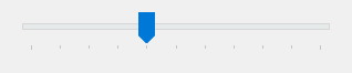
Slider1.Min = 0
Slider1.Max = 200
Slider1.TickFrequency = 20
Slider1.Value = 50
Slider1.SmallChange = 5
Slider1.LargeChange = 50
Debug.Print Slider1.Value; Slider1.GetNumTicks
' Output:
'  50  11
The control stands in place of the Slider of the Microsoft common controls (MSCOMCTL.OCX). The WinNativeCommonCtls package has a Slider too; this one adds ClearSel, GetNumTicks and GetTickPosition, the place and size of the thumb and of the channel (ThumbLeft and the members like it), Transparent, Reversed, the owner-drawn mode of DrawMode, and the events ContextMenu, ItemDraw and ModifyTipText.
Of the common members, the control has those under Name and place, Window handles, Mouse but DblClick, Keyboard and focus, Dragging the control, OLE drag and drop and Right-to-left, RightToLeftLayout included, and VisualStyles. It has no Font or FontQuality, since it shows no text of its own.
- The range and the value
- What the user’s moves raise
- Tick marks
- A selected range
- The size and the parts of the slider
- The tip
- Drawing the slider in code
- Properties
- Methods
- Events
- SldDrawModeConstants
- SldOrientationConstants
- SldOwnerDrawItemConstants
- SldTickStyleConstants
- SldTipSideConstants
- See Also
The range and the value
Min and Max are the ends of the range, and Value is the position of the thumb in it.
A Value outside the range becomes the nearest end of it. A Max that is not greater than Min, and a Min that is not less than Max, raise run-time error 380, so a program that moves the whole range upward sets Max first. A range that no longer holds the value moves the value to the nearest end.
Slider1.Max = 100
Slider1.Min = 10
Slider1.Value = 500
Debug.Print Slider1.Value
Slider1.Value = 50
Slider1.Max = 40                        ' the value moves to the new end
Debug.Print Slider1.Value
On Error Resume Next
Slider1.Min = 40
Debug.Print Err.Number
' Output:
'  100
'  40
'  380
A slider that has the focus takes the arrow keys, Page Up, Page Down, Home and End. The Left, Up, Page Up and Home keys move the thumb toward Min, and the Right, Down, Page Down and End keys toward Max. The arrow keys move it by SmallChange, and Page Up and Page Down by LargeChange; Home and End go to the ends.
A click in the channel at the side of the thumb moves it by LargeChange too.
What the user’s moves raise
While the user drags the thumb, the control raises Scroll at each new position. When the user lets the thumb go, or ends a move made with the keyboard, it raises Change. An assignment to Value raises Change when it changes the value, and never Scroll.
With the keyboard, Change is raised when the key is released. A handler that shows the value while the thumb moves is a Scroll handler; one that acts on the final value is a Change handler.
Private Sub Slider1_Scroll()
    Debug.Print "moving", Slider1.Value
End Sub

Private Sub Slider1_Change()
    Debug.Print "chosen", Slider1.Value
End Sub
Tick marks
TickStyle says on which side of the slider the tick marks are drawn, or that there are none. TickFrequency is the number of values from one mark to the next. GetNumTicks counts the marks, the two at the ends of the range included, and GetTickPosition gives where one is.
Slider1.Min = 0
Slider1.Max = 100
Slider1.TickFrequency = 25
Debug.Print Slider1.GetNumTicks
Slider1.TickStyle = SldTickStyleNone
Debug.Print Slider1.GetNumTicks
' Output:
'  5
'  0
A selected range
With SelectRange set to True the slider can mark a part of the range, drawn in a wider channel with its two ends marked. SelStart is the first value of the part and SelLength the number of values it spans. The part is only a mark: it does not limit the thumb.
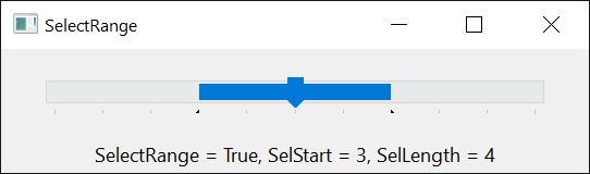
Switching SelectRange on makes the part start at the thumb, with a length of 0. A SelStart outside the range, and a SelLength that is negative or reaches past Max, raise run-time error 380. A Max below the end of the part shortens it, and a Min above its start moves the start to Min and makes the length 0. ClearSel removes the part, leaving SelLength at 0.
Slider1.Max = 100
Slider1.SelectRange = True
Slider1.SelStart = 20
Slider1.SelLength = 50
Debug.Print Slider1.SelStart; Slider1.SelLength
Slider1.Max = 60
Debug.Print Slider1.SelLength
Slider1.ClearSel
Debug.Print Slider1.SelLength
' Output:
'  20  50
'  40
'  0
While SelectRange is False, SelStart is the value of the slider, and assigning it moves the thumb. SelLength is 0, and assigning another value raises run-time error 380.
The size and the parts of the slider
A slider is at most 45 pixels thick, measured at 96 dpi: its height when it is horizontal, its width when it is vertical. A larger Height or Width is cut to that. Changing Orientation exchanges the width and the height of the control.
The thumb is the part that moves, and the channel is the groove it moves in. ThumbLeft, ThumbTop, ThumbWidth and ThumbHeight give the rectangle of the thumb, and ChannelLeft, ChannelTop, ChannelWidth and ChannelHeight that of the channel, measured from the top left corner of the control and in the scale units of the container. A program uses them to put another control at the thumb.
The tip
While the user drags the thumb, the slider shows a small tip with the value, when ShowTip is True. TipSide is the side of the slider it appears on. The event ModifyTipText lets a program change the text, and hWndToolTip is the window of the tip.
Private Sub Slider1_ModifyTipText(Text As String)
    Text = Text & " %"
End Sub
Drawing the slider in code
With DrawMode set to SldDrawModeOwnerDraw the control raises ItemDraw for each of its three parts: the tick marks, the thumb and the channel. The handler draws a part on the device context the event gives it, or sets Cancel to True to let Windows draw that part. A part the handler does not draw, and does not cancel, is not drawn at all, so a slider in this mode with no ItemDraw handler shows nothing.
Private Declare PtrSafe Function Rectangle Lib "gdi32" (ByVal hDC As LongPtr, ByVal Left As Long, ByVal Top As Long, ByVal Right As Long, ByVal Bottom As Long) As Long

Private Sub Slider1_ItemDraw(ByVal Item As SldOwnerDrawItemConstants, Cancel As Boolean, ByVal ItemState As Long, ByVal hDC As Long, ByVal Left As Long, ByVal Top As Long, ByVal Right As Long, ByVal Bottom As Long)
    If Item = SldOwnerDrawItemThumb Then
        Rectangle hDC, Left, Top, Right, Bottom      ' a box for the thumb
    Else
        Cancel = True                                ' Windows draws the tick marks and the channel
    End If
End Sub
Properties
BackColor
The color of the control’s background, behind the channel. OLE_COLOR. Default: vbButtonFace. With Transparent set to True the control shows what is behind it instead.
ChannelHeight
The height of the channel, in the scale units of the container. Single, read-only. See The size and the parts of the slider.
ChannelLeft
The distance from the left edge of the control to the left edge of the channel, in the scale units of the container. Single, read-only.
ChannelTop
The distance from the top edge of the control to the top edge of the channel, in the scale units of the container. Single, read-only.
ChannelWidth
The width of the channel, in the scale units of the container. Single, read-only.
DrawMode
Whether Windows or the program draws the parts of the slider. A member of SldDrawModeConstants. Default: SldDrawModeNormal. See Drawing the slider in code.
Another value raises run-time error 380. The same holds for Orientation, TickStyle and TipSide.
HideThumb
Whether the thumb is hidden. Boolean. Default: False. With True the slider draws no thumb, so the user has nothing to drag.
hWndToolTip
The handle of the window that shows the tip. LongPtr, read-only. It is 0 while ShowTip is False.
LargeChange
How far the thumb moves for the Page Up and Page Down keys, and for a click in the channel at the side of the thumb. Long. Default: 2.
Max
The upper end of the range. Long. Default: 10. See The range and the value for the values it refuses.
Min
The lower end of the range. Long. Default: 0.
Orientation
Whether the slider is horizontal or vertical. A member of SldOrientationConstants. Default: SldOrientationHorizontal. A change exchanges the width and the height of the control.
Reversed
Whether the Windows styles TBS_REVERSED and TBS_DOWNISLEFT are set on the slider. Boolean. Default: False. Windows’ slider ignores both: the thumb stands where it did for each value, and the keys keep their directions.
SelectRange
Whether the slider can mark a selected part of the range. Boolean. Default: False. See A selected range.
SelLength
The number of values the selected part spans. Long. Default: 0.
SelStart
The first value of the selected part. Long. Default: 0, and Value while SelectRange is False.
ShowTip
Whether the slider shows a tip with the value while the user drags the thumb. Boolean. Default: True.
SmallChange
How far the thumb moves for an arrow key. Long. Default: 1.
ThumbHeight
The height of the thumb, in the scale units of the container. Single, read-only.
ThumbLeft
The distance from the left edge of the control to the left edge of the thumb, in the scale units of the container. Single, read-only.
ThumbTop
The distance from the top edge of the control to the top edge of the thumb, in the scale units of the container. Single, read-only.
ThumbWidth
The width of the thumb, in the scale units of the container. Single, read-only.
TickFrequency
The number of values from one tick mark to the next. Long. Default: 1. A value of 0 or less raises run-time error 380.
TickStyle
Where the tick marks are drawn. A member of SldTickStyleConstants. Default: SldTickStyleBottomRight.
TipSide
The side of the slider on which the tip appears. A member of SldTipSideConstants. Default: SldTipSideAboveLeft. It matters while ShowTip is True.
Transparent
Whether the control draws a copy of what is behind it in place of its BackColor, so that the slider looks transparent. Boolean. Default: False.
Value
The position of the thumb in the range. Long. Default: 0. It is the control’s default property. A value outside the range becomes the nearest end. A change by an assignment raises Change.
Methods
ClearSel
Removes the selected part of the range. SelectRange stays as it is.
Syntax: object.ClearSel
GetNumTicks
Returns the number of tick marks, the two at the ends of the range included, as a Long. It is 0 when TickStyle is SldTickStyleNone.
Syntax: object.GetNumTicks
GetTickPosition
Returns where a tick mark is, in the scale units of the container, as a Single: its distance from the left edge of the control for a horizontal slider, from the top edge for a vertical one.
Syntax: object.GetTickPosition( Index )
- Index
- required A Long: the number of the tick mark, counted from 1.
An Index below 1, or one for which Windows reports no such mark, raises run-time error 380.
Events
Change
Raised when the user has finished moving the thumb, and when an assignment to Value changed it. See What the user’s moves raise.
Syntax: object_Change( )
ContextMenu
Raised when the user presses the right mouse button over the slider, or presses Shift+F10 or the menu key, so that the program can show a menu of its own.
Syntax: object_ContextMenu( X As Single, Y As Single )
- X, Y
- The position of the pointer, measured from the control’s top left corner, in the scale units of the container.
When the keyboard asked for the menu, X and Y are both -1.
ItemDraw
Raised for each part of the slider that has to be drawn, while DrawMode is SldDrawModeOwnerDraw. See Drawing the slider in code.
Syntax: object_ItemDraw( Item As SldOwnerDrawItemConstants, Cancel As Boolean, ItemState As Long, hDC As Long, Left As Long, Top As Long, Right As Long, Bottom As Long )
- Item
- The part to draw, a member of SldOwnerDrawItemConstants.
- Cancel
- False when the event is raised. A handler that draws the part leaves it False; one that sets it to True has Windows draw the part.
- ItemState
- The state of the part, the sum of the CDIS flags of the custom drawing of Windows: 1 while the thumb is pressed, 4 when the slider is disabled.
- hDC
- The device context to draw on.
- Left, Top, Right, Bottom
- The rectangle of the part, in pixels, measured from the top left corner of the slider.
ModifyTipText
Raised when the slider is about to show its tip, while ShowTip is True. The handler changes the text.
Syntax: object_ModifyTipText( Text As String )
- Text
- The text of the tip, which is the value as a number when the event is raised.
MouseDown, MouseMove, MouseUp
As the common events of these names; X and Y are in twips, whatever the scale units of the control’s container, measured from the top left corner of the control.
Scroll
Raised at each new position while the user drags the thumb. Value already has the position.
Syntax: object_Scroll( )
SldDrawModeConstants
The values of DrawMode.
| Member | Value | Description |
|---|---|---|
| SldDrawModeNormal | 0 | Windows draws the slider. |
| SldDrawModeOwnerDraw | 1 | The program draws the parts, in ItemDraw. |
SldOrientationConstants
The values of Orientation.
| Member | Value | Description |
|---|---|---|
| SldOrientationHorizontal | 0 | The thumb moves from left to right. |
| SldOrientationVertical | 1 | The thumb moves from top to bottom. |
SldOwnerDrawItemConstants
The parts of a slider that ItemDraw draws.
| Member | Value | Description |
|---|---|---|
| SldOwnerDrawItemTics | 1 | The tick marks. |
| SldOwnerDrawItemThumb | 2 | The thumb. |
| SldOwnerDrawItemChannel | 3 | The channel. |
SldTickStyleConstants
The values of TickStyle.

| Member | Value | Description |
|---|---|---|
| SldTickStyleBottomRight | 0 | Below a horizontal slider, at the right of a vertical one. |
| SldTickStyleTopLeft | 1 | Above a horizontal slider, at the left of a vertical one. |
| SldTickStyleBoth | 2 | On both sides. |
| SldTickStyleNone | 3 | No tick marks. |
SldTipSideConstants
The values of TipSide.
| Member | Value | Description |
|---|---|---|
| SldTipSideAboveLeft | 0 | Above a horizontal slider, at the left of a vertical one. |
| SldTipSideBelowRight | 1 | Below a horizontal slider, at the right of a vertical one. |
See Also
- Common members – the members this control shares with the package’s other controls
- Slider – the control of the same name in the WinNativeCommonCtls package