TabStrip class
A TabStrip is a row of tabs, or of buttons, of which one is selected. It shows no pages of its own: a program shows the controls that belong to the selected tab, and hides the others.
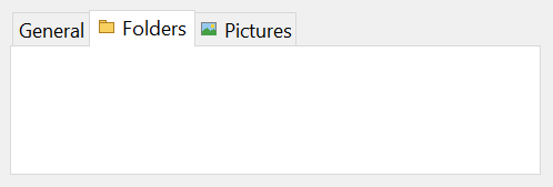
TabStrip1.Tabs(1).Caption = "General"
TabStrip1.Tabs.Add , "view", "View"
TabStrip1.Tabs.Add , "edit", "Edit"
TabStrip1.Tabs("view").Selected = True
Debug.Print TabStrip1.Tabs.Count
Debug.Print TabStrip1.SelectedItem.Key
' Output:
'  3
' view
The control stands in place of the TabStrip of the Microsoft common controls (MSCOMCTL.OCX).
Of the common members, the control has all but the Click and DblClick events: Name and place, Window handles, Font and visual styles, Mouse, Keyboard and focus, Dragging the control, OLE drag and drop and Right-to-left, RightToLeftLayout included. A change of the selected tab raises TabBeforeClick and TabClick.
Its sub-objects have pages of their own:
- Tabs and the selected tab
- Changing the selected tab
- Pictures on the tabs
- The look of the strip
- The area inside the tabs
- Properties
- Methods
- Events
- TbsPlacementConstants
- TbsStyleConstants
- TbsTabStyleConstants
- TbsTabWidthStyleConstants
- TbsTabAlignmentConstants
- TbsHitResultConstants
- TbsDrawModeConstants
- See Also
Tabs and the selected tab
A tab strip drawn on a form has one tab, with no caption, and it is selected. Tabs returns the collection, and its Add method makes more. The tabs are numbered from 1, and a program can also name each by a key.
SelectedItem is the selected tab, or Nothing. A program selects a tab by assigning True to its Selected, or by setting SelectedItem with Set. The tab strip changes nothing else on the form: the program’s TabClick handler shows and hides the controls.
Assigning False to the Selected of the selected tab, or Nothing to SelectedItem, leaves no tab selected. False on another tab does nothing.
Changing the selected tab
A change of the selected tab raises TabBeforeClick first. A handler that sets Cancel to True keeps the change from happening, and TabClick is not raised. Otherwise the tab is selected and TabClick follows. Both are raised by an assignment to Selected as well, also for the tab that is selected already.
Dim Watch As New TabWatcher
Set Watch.Strip = TabStrip1
TabStrip1.Tabs(1).Caption = "One"
TabStrip1.Tabs.Add , , "Two"
TabStrip1.Tabs(2).Selected = True
Watch.Cancel = True                     ' the handler of TabBeforeClick says Cancel
TabStrip1.Tabs(1).Selected = True
Debug.Print TabStrip1.SelectedItem.Caption
' Output:
' TabBeforeClick Two
' TabClick Two
' TabBeforeClick One
' Two
TabWatcher in this sample is a class of the program’s own that holds the control WithEvents and prints the events.
When the user clicks a tab, the argument of TabBeforeClick is the tab that is selected now and is about to be left, and that of TabClick is the tab clicked. The two events come before the MouseDown event of the click. A program that assigns Selected gets the tab that is to be selected in both events.
While TabScrollWheel is True, a turn of the mouse wheel over the strip selects the next tab or the previous one, with the same two events.
A letter that follows an ampersand in a tab’s Caption is its access key: Alt and the letter select the tab.
Pictures on the tabs
A tab shows a picture from an ImageList control. The program gives the tab strip the list with ImageList, and a tab names its picture by number or by key with Image.
ImageList1.ListImages.Add , "red", TabSquare(vbRed)
ImageList1.ListImages.Add , "blue", TabSquare(vbBlue)
Set TabStrip1.ImageList = ImageList1
TabStrip1.Tabs.Add , "two", "Two", "blue"
TabStrip1.Tabs(1).Image = 1
Debug.Print TabStrip1.Tabs("two").ImageIndex; TabStrip1.Tabs(1).ImageIndex
' Output:
'  2  1
TabSquare in this sample is a function of the program’s own that returns a bitmap of one color, 16 pixels wide and high. The picture of a tab can be named by key or by number, and the tab’s ImageIndex is always the number.
The look of the strip
Style chooses tabs, buttons or flat buttons. TabWidthStyle decides the widths: tabs stretched to fill each row, tabs of their own width, or tabs all of one size, TabFixedWidth by TabFixedHeight. With visual styles the tabs are always along the top, whatever Placement says. When the tabs do not fit one row, MultiRow puts them in several, and without it the strip shows two small arrows to scroll the row.
A change of most of these properties makes the control’s window again. The tabs, their keys, tags, tool tip texts and the selected tab stay as they were.
The area inside the tabs
ClientLeft, ClientTop, ClientWidth and ClientHeight are the rectangle inside the tabs, where the program puts the controls of the selected tab. Assigning ClientWidth or ClientHeight changes the size of the control so that the rectangle has that size.
Properties
BackColor
The color behind the tabs. OLE_COLOR. Default: vbButtonFace. With TbsStyleTabs it is the strip along the tabs, not the area below them; with a style of buttons it is the whole control.
ClientHeight
The height of the area inside the tabs, in the scale units of the control’s container. Single. An assignment changes the height of the control, see The area inside the tabs.
The control becomes higher than the value, by the height of the tabs and the border.
ClientLeft
The distance from the left edge of the control to the area inside the tabs, in the scale units of the control’s container. Single, read-only.
ClientTop
The distance from the top edge of the control to the area inside the tabs, in the scale units of the control’s container. Single, read-only.
ClientWidth
The width of the area inside the tabs, in the scale units of the control’s container. Single. An assignment changes the width of the control, see The area inside the tabs. The control becomes wider than the value, by the border.
DoubleBuffer
Whether the control draws itself in a bitmap off the screen first, which reduces flicker. Boolean. Default: True.
DrawMode
Whether Windows draws the tabs or the program does. A member of TbsDrawModeConstants. Default: TbsDrawModeNormal. With TbsDrawModeOwnerDrawFixed the control raises ItemDraw for each tab.
The property can be set only in the form designer. An assignment at run time raises run-time error 382, DrawMode property is read-only at run time, whatever the value, but a value that is not a member raises 380.
hWndToolTip
The handle of the tool tip window of the tab control, which shows the tabs’ ToolTipText. LongPtr, read-only.
HotTracking
Whether the tab under the pointer is highlighted. Boolean. Default: True. The visual style of Windows can draw its own highlight whatever the value. A change makes the window again.
ImageList
The list of the pictures that the tabs show. A Variant: assigned a control of the class ImageList, the name of such a control on the same form as a String, or the handle of a Windows image list as a Long. It returns the control, or the handle where one was given.
Another kind of object raises run-time error 35610, Invalid object, and a value of another type raises 13. A name that no ImageList has leaves the strip without one, with no error.
The control must have pictures by the time it is given: see ImageList for what a list does when its pictures change.
MultiRow
Whether tabs that do not fit one row go to further rows. Boolean. Default: True. False keeps a single row and shows arrows to scroll it. TabStyle set to TbsTabStyleOpposite keeps it True. A change makes the window again.
MultiSelect
Whether the user can select several tabs by holding Ctrl while clicking. Boolean. Default: False. It applies to TbsStyleButtons and TbsStyleFlatButtons. A change makes the window again.
Placement
The side of the control where the tabs are. A member of TbsPlacementConstants. Default: TbsPlacementTop. A value that is not a member raises run-time error 380. It takes effect only in a program without visual styles. With them the tabs stay at the top.
The value is kept and returned all the same.
RowCount
The number of rows of tabs now. Long, read-only. Only a strip with MultiRow True has more than one.
SelectedItem
The selected tab. A TbsTab, or Nothing where no tab is selected. Assigned with Set, it selects that tab as Selected does, with its events, and Nothing leaves no tab selected, without events. See Tabs and the selected tab.
Separators
Whether the control draws separators between the buttons. Boolean. Default: True. It applies to TbsStyleFlatButtons.
ShowTips
Whether a tab shows its ToolTipText when the pointer rests on it. Boolean. Default: False.
Style
Whether the strip is drawn with tabs, with buttons or with flat buttons. A member of TbsStyleConstants. Default: TbsStyleTabs. A change makes the window again.
A value that is not a member raises run-time error 380. While TabStyle is TbsTabStyleOpposite the style is always TbsStyleTabs: a change to another one is undone.
TabAlignment
Where a tab puts its picture and its caption. A member of TbsTabAlignmentConstants. Default: TbsTabAlignmentStandard. A value that is not a member raises run-time error 380.
It has an effect only while TabWidthStyle is TbsTabWidthStyleFixed: a change of the width style to another value sets it to TbsTabAlignmentStandard.
TabFixedHeight
The height of every tab while TabWidthStyle is TbsTabWidthStyleFixed, in the scale units of the control’s container. Single. Default: 0.
A negative value raises run-time error 380.
TabFixedWidth
The width of every tab while TabWidthStyle is TbsTabWidthStyleFixed, in the scale units of the control’s container. Single. Default: 0. A negative value raises run-time error 380.
TabMinWidth
The width that a tab does not go below, in the scale units of the control’s container. Single. Default: 40 device-independent pixels. -1 gives the tabs the width Windows gives them. Another negative value raises run-time error 380.
TabScrollWheel
Whether the mouse wheel selects the next or the previous tab. Boolean. Default: True. See Changing the selected tab.
Tabs
The collection of the tabs. A TbsTabs object, read-only.
TabStyle
How the rows of tabs are arranged when the strip has several. A member of TbsTabStyleConstants. Default: TbsTabStyleStandard. A value that is not a member raises run-time error 380. TbsTabStyleOpposite sets Style to TbsStyleTabs and MultiRow to True.
TabWidthStyle
How wide the tabs are. A member of TbsTabWidthStyleConstants. Default: TbsTabWidthStyleJustified. A value that is not a member raises run-time error 380.
Transparent
Whether the background of the strip copies what is behind the control, so that it looks transparent. Boolean. Default: False.
Methods
DeselectAll
Clears the selection of every tab. It is meant for the styles of buttons, where tabs stay pressed.
Syntax: object.DeselectAll
DrawBackground
Draws the strip’s background onto a device context, as it lies behind a window of another control. A program calls it when it paints a control that sits on the strip, so that the control’s background matches the strip’s.
Syntax: object.DrawBackground hWnd, hDC
- hWnd
- required A LongPtr: the handle of the window of the control that is painted.
- hDC
- required A LongPtr: the device context to draw into.
HitTest
Returns the tab at a point of the control, or Nothing where there is none.
Syntax: object.HitTest( X, Y [, HitResult ] ) As TbsTab
- X, Y
- required Single: the point, measured from the top left corner of the control in the scale units of the control’s container.
- HitResult
- optional A member of TbsHitResultConstants, set by the call to say what part of the tab is at the point.
A point that is on no tab returns Nothing.
Events
ItemDraw
Raised for each tab that the program draws, while DrawMode is TbsDrawModeOwnerDrawFixed.
Syntax: object_ItemDraw( TabItem As TbsTab, ItemAction As Long, ItemState As Long, hDC As Long, Left As Long, Top As Long, Right As Long, Bottom As Long )
- TabItem
- The TbsTab to draw.
- ItemAction
- What Windows asks for, a value of the ODA constants of Windows: 1 to draw the whole tab, 2 for a change of selection, 4 for a change of focus.
- ItemState
- The state of the tab, the sum of the ODS constants of Windows: 1 for selected, 2 for grayed, 4 for disabled, 8 for checked, 16 for focused.
- hDC
- The device context to draw into.
- Left, Top, Right, Bottom
- The rectangle of the tab, in pixels of the device context.
TabBeforeClick
Raised before the selected tab changes, by a click, the wheel, an access key or an assignment. A handler that sets Cancel to True keeps the tab selected as it is. See Changing the selected tab.
Syntax: object_TabBeforeClick( TabItem As TbsTab, Cancel As Boolean )
- TabItem
- A TbsTab: the tab that is selected now when the user clicks, and the tab that is to be selected when the program assigns Selected.
- Cancel
- False when the event is raised. A handler that sets it to True keeps the change from happening.
TabClick
Raised after a tab is selected, by a click, the wheel, an access key or an assignment to Selected, also for a tab that was selected already.
Syntax: object_TabClick( TabItem As TbsTab )
- TabItem
- The TbsTab that is now selected.
TbsPlacementConstants
The values of Placement.
| Member | Value | Description |
|---|---|---|
| TbsPlacementTop | 0 | The tabs are along the top edge. |
| TbsPlacementBottom | 1 | The tabs are along the bottom edge. |
| TbsPlacementLeft | 2 | The tabs are along the left edge. |
| TbsPlacementRight | 3 | The tabs are along the right edge. |
TbsStyleConstants
The values of Style.
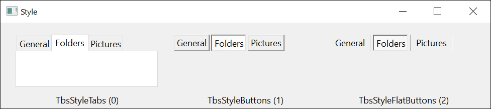
| Member | Value | Description |
|---|---|---|
| TbsStyleTabs | 0 | Tabs. |
| TbsStyleButtons | 1 | Buttons. |
| TbsStyleFlatButtons | 2 | Flat buttons, which look raised under the pointer. |
TbsTabStyleConstants
The values of TabStyle.
| Member | Value | Description |
|---|---|---|
| TbsTabStyleStandard | 0 | When a tab is selected, the row it is in moves next to the page area. |
| TbsTabStyleOpposite | 1 | When a tab is selected, the tabs that are not needed in front of it move to the opposite side of the control. It sets Style to tabs and MultiRow to True. |
TbsTabWidthStyleConstants
The values of TabWidthStyle.
| Member | Value | Description |
|---|---|---|
| TbsTabWidthStyleJustified | 0 | The tabs of a row are made wider to fill it. |
| TbsTabWidthStyleNonJustified | 1 | Each tab keeps the width its content needs, and a row may end short of the right edge. |
| TbsTabWidthStyleFixed | 2 | Every tab is TabFixedWidth wide and TabFixedHeight high. |
TbsTabAlignmentConstants
The values of TabAlignment, which has an effect with TbsTabWidthStyleFixed.
| Member | Value | Description |
|---|---|---|
| TbsTabAlignmentStandard | 0 | The picture and the caption are in the middle of the tab. |
| TbsTabAlignmentImageLeft | 1 | The picture is at the left edge of the tab. |
| TbsTabAlignmentImageCaptionLeft | 2 | The picture and the caption are at the left edge of the tab. |
TbsHitResultConstants
The values that HitTest gives its HitResult argument.
| Member | Value | Description |
|---|---|---|
| TbsHitResultNoWhere | 0 | The point is on no tab. |
| TbsHitResultItem | 1 | The point is on a tab, away from its picture and caption. |
| TbsHitResultItemIcon | 2 | The point is on a tab’s picture. |
| TbsHitResultItemLabel | 3 | The point is on a tab’s caption. |
TbsDrawModeConstants
The values of DrawMode.
| Member | Value | Description |
|---|---|---|
| TbsDrawModeNormal | 0 | Windows draws the tabs. |
| TbsDrawModeOwnerDrawFixed | 1 | The program draws each tab in ItemDraw. |
See Also
- Common members – the members this control shares with the package’s other controls
- TbsTabs – the collection of the tabs
- TbsTab – one tab
- ImageList – the list of the pictures that the tabs show