ToolBar class
A ToolBar is a row of buttons that start the commands of a program. A button can show a picture, a caption or both, can stay pressed like a check box, can open a drop-down menu, and a separator puts a gap between groups of buttons. The user can also rearrange the buttons in a dialog of Windows.
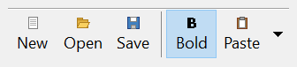
ToolBar1.Buttons.Add , "new", "New"
ToolBar1.Buttons.Add , "open", "Open"
ToolBar1.Buttons.Add , , , TbrButtonStyleSeparator
ToolBar1.Buttons.Add , "save", "Save"
Debug.Print ToolBar1.Buttons.Count
Debug.Print ToolBar1.Buttons("open").Index
' Output:
'  4
'  2
The control stands in place of the Toolbar of the Microsoft common controls (MSCOMCTL.OCX). The package’s classes for its parts are TbrButtons, the collection of the buttons, TbrButton, one button, TbrButtonMenus, the collection of the menu items of a drop-down button, and TbrButtonMenu, one menu item.
Of the common members, the control has those under Name and place but HelpContextID, Window handles, Font and visual styles, Mouse, Dragging the control, OLE drag and drop and Right-to-left, RightToLeftLayout included. It never takes the focus, so it has no keyboard events.
- Buttons
- Pictures
- How the buttons are laid out
- Hot buttons
- Menus of drop-down buttons
- Events of the mouse
- Keys and mnemonics
- Customizing
- Moving a button by dragging
- Properties
- Methods
- Events
- TbrButtonStyleConstants
- TbrButtonValueConstants
- TbrOrientationConstants
- TbrStyleConstants
- TbrTextAlignConstants
- See Also
Buttons
Buttons returns the collection of the buttons. Add puts a button into it, and the Style of the button decides what it does. A button of the default style is a push button: a click raises ButtonClick. A check button stays pressed until the next click, and a check group button does the same while it is the only button pressed among the group buttons next to it. A separator is a gap and takes no click. A drop-down button has an arrow beside the button, and a whole drop-down button opens its menu wherever it is clicked.
ToolBar1.Buttons.Add , "left", "Left", TbrButtonStyleCheckGroup
ToolBar1.Buttons.Add , "center", "Center", TbrButtonStyleCheckGroup
ToolBar1.Buttons.Add , "bold", "Bold", TbrButtonStyleCheck
ToolBar1.Buttons("left").Value = TbrButtonValuePressed
ToolBar1.Buttons("center").Value = TbrButtonValuePressed
ToolBar1.Buttons("bold").Value = TbrButtonValuePressed
Debug.Print ToolBar1.Buttons("left").Value; ToolBar1.Buttons("center").Value; ToolBar1.Buttons("bold").Value
' Output:
'  0  1  1
A button has two places. Its Index is its place in the collection, and stays when the user or the program moves the button. Its Position is its place on the toolbar.
ToolBar1.Buttons.Add , "a", "A"
ToolBar1.Buttons.Add , "b", "B"
ToolBar1.Buttons.Add , "c", "C"
ToolBar1.Buttons("a").Position = 3
Debug.Print ToolBar1.Buttons("a").Position; ToolBar1.Buttons("a").Index
Debug.Print ToolBar1.Buttons(1).Key
' Output:
'  3  1
' a
Warning 1.8.141.0
A change of TextAlignment, of Orientation that turns the buttons to the other direction, and any assignment to RightToLeft, RightToLeftLayout or RightToLeftMode, makes the toolbar window again and gives each button a new TbrButton object. A variable that held a button before the change does not reach it afterwards: its Position is 0, and what the program sets on it is lost. The program gets the button again from Buttons after such a change.
A change of Style or of the Font keeps the objects.
Pictures
A button shows a picture from an image list: an ImageList control, which the program gives to ImageList. The Image of a button, and the Image argument of Add, is the number of the picture or its key. The toolbar draws a button that is under the pointer with the pictures of HotImageList, a disabled button with those of DisabledImageList, and, in a program with visual styles, a pressed button with those of PressedImageList. A state whose list the toolbar does not have uses the pictures of ImageList.
ImageList1.ListImages.Add , "new", ColorSquare(vbWhite)
ImageList1.ListImages.Add , "open", ColorSquare(vbYellow)
Set ToolBar1.ImageList = ImageList1         ' after the list has its pictures
Dim Button As TbrButton
Set Button = ToolBar1.Buttons.Add(, "open", "Open", , "open")
Debug.Print Button.ImageIndex
' Output:
'  2
ColorSquare in the sample is a function of the program’s own that returns a bitmap of one color, 16 pixels wide and high. An image list that has no picture is not taken, so a program fills the list first and gives it to the toolbar afterwards, as ImageList says.
All the lists of one toolbar have pictures of the same size. A list whose pictures have another size than those of the lists the toolbar already has raises run-time error 380. A control that is not an ImageList raises error 35610, and a value of another type than an object, a string or a Long raises error 13. A Long is the handle that the hImageList property of an image list gives, and a string is the name of an ImageList control on the same form as the toolbar. A name that no such control has, and Nothing, take the image list away.
How the buttons are laid out
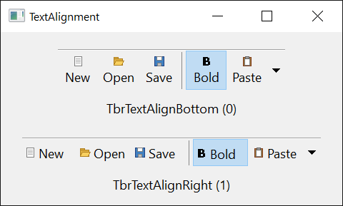
A button is as wide as ButtonWidth and as high as ButtonHeight, or as the picture and the caption need, if that is more. A button whose AutoSize is True is as wide as its caption and picture need, and CustomWidth gives a button a width of its own. MinButtonWidth and MaxButtonWidth limit the width. TextAlignment puts a caption under its picture or beside it, and MaxTextRows lets a caption under its picture use more than one row.
A horizontal toolbar sets its own height to that of its rows of buttons, so that a Height the program assigns does not stay.
With Wrappable set to True the buttons that do not fit in the toolbar’s width go on to another row. Orientation set to TbrOrientationVertical stacks the buttons in a column, and the toolbar then sets its width instead of its height.
GetIdealSize returns the size at which the toolbar shows every button, and a program uses it to size the toolbar.
Dim IdealWidth As Single, IdealHeight As Single
ToolBar1.GetIdealSize IdealWidth, IdealHeight
ToolBar1.Width = IdealWidth
Hot buttons
The button that the pointer is over is the hot button. With HotTracking set to True, a toolbar of the standard style draws it in the highlight color, and AnchorHot keeps the last hot button hot when the pointer leaves the toolbar. HotItem returns the hot button, or makes one hot, and ButtonHotChanged is raised each time the hot button changes.
A change of the hot button raises two events: one with Hot True for the new button, then one with Hot False for the old one.
Menus of drop-down buttons
A button of style TbrButtonStyleDropDown or TbrButtonStyleWholeDropDown shows a menu when the user clicks its arrow, or the whole button for the second style. The toolbar raises ButtonDropDown first, so that a program can fill the menu, then shows it. The menu holds the items of the button’s ButtonMenus collection, or, where the program has given the button an hMenu, that menu of Windows. A chosen item raises ButtonMenuClick with its TbrButtonMenu, or, for an hMenu, ButtonMenuClick2 with the identifier of the item.
Dim Button As TbrButton
Set Button = ToolBar1.Buttons.Add(, "paste", "Paste", TbrButtonStyleDropDown)
Button.ButtonMenus.Add , "plain", "Paste as plain text"
Button.ButtonMenus.Add , "special", "Paste special..."
Button.ButtonMenus("special").Enabled = False
Debug.Print Button.ButtonMenus.Count
' Output:
'  2
Private Sub ToolBar1_ButtonMenuClick(ByVal ButtonMenu As TbrButtonMenu)
    Debug.Print ButtonMenu.Parent.Key; ButtonMenu.Key
End Sub
Events of the mouse
A click on a button raises ButtonClick with the button. The events of the control come around it: MouseDown first, then ButtonClick, then MouseUp, then Click. A click on a separator raises the same events without ButtonClick.
Private Sub ToolBar1_ButtonClick(ByVal Button As TbrButton)
    Select Case Button.Key
        Case "new": Debug.Print "New"
        Case "open": Debug.Print "Open"
    End Select
End Sub
With MouseTrack set to True the toolbar raises ButtonMouseEnter and ButtonMouseLeave as well. When the pointer moves onto a button from outside the toolbar, MouseEnter comes first, then ButtonMouseEnter. When it moves from one button to another, ButtonMouseLeave for the first comes before ButtonMouseEnter for the second, and when it leaves the toolbar, ButtonMouseLeave comes before MouseLeave.
Keys and mnemonics
A caption with an ampersand before a letter, such as &Open, has that letter as its mnemonic. FindMnemonic returns the button for a character, and ContainerKeyDown makes the Alt key with the mnemonic press the button. The toolbar takes no focus, so the form passes it the keys, with its KeyPreview set to True.
Private Sub Form_KeyDown(KeyCode As Integer, Shift As Integer)
    ToolBar1.ContainerKeyDown KeyCode, Shift
End Sub
Customizing
With AllowCustomize set to True, the user can move a button along the toolbar by dragging it with the Shift key held down (the Alt key with AltDrag), drag it off to remove it, and double-click the toolbar to open the dialog of Windows that adds, removes and moves buttons. Customize opens that dialog from code. The dialog names a button by its Description, where it has one.
The events of a customization are BeginCustomization, InitCustomizationDialog, CustomizationChange, ResetCustomizations, CustomizationHelp and EndCustomization. SaveToolBar and RestoreToolBar keep the arrangement the user made in the registry between runs of a program.
Moving a button by dragging
A program that lets the user drag a button to another place shows where the button will go with an insertion mark, a vertical line between two buttons. HitTestInsertMark says which button a point is nearest to and on which side of it, and InsertMark draws the line, in InsertMarkColor.
Private Sub ToolBar1_OLEDragOver(Data As DataObject, Effect As Long, Button As Integer, Shift As Integer, X As Single, Y As Single, State As Integer)
    Dim After As Boolean
    Set ToolBar1.InsertMark(After) = ToolBar1.HitTestInsertMark(X, Y, After)
End Sub
Properties
Align
The edge of the form that the control is attached to, where it takes the form’s whole width or height. A member of AlignConstants. Default: vbAlignNone.
Note 1.8.141.0 BETA 1042
twinBASIC has not implemented Align: an assignment compiles with the warning TB0009 and changes nothing, and the property goes on returning vbAlignNone. A program places and sizes the toolbar itself.
AllowCustomize
Whether the user can customize the toolbar. Boolean. Default: True. See Customizing.
AltDrag
Whether the user drags a button along the toolbar with the Alt key held down instead of the Shift key. Boolean. Default: False. It has an effect while AllowCustomize is True.
AnchorHot
Whether the hot button stays hot when the pointer leaves the toolbar. Boolean. Default: False.
BackColor
The color behind the buttons. OLE_COLOR. Default: vbButtonFace. With Transparent set to True the toolbar draws what is behind it over the color.
ButtonHeight
The height of a button, in the container’s scale units. Single. Default: 22 device-independent pixels.
A height below the default is raised to it.
A negative value raises run-time error 380. The property returns the height the toolbar uses for its buttons once it has buttons, which is more than the value assigned where a caption or a picture needs the room.
ButtonWidth
The width of a button, in the container’s scale units. Single. Default: 24 device-independent pixels. The rules are those of ButtonHeight.
Buttons
The collection of the buttons. A TbrButtons object, read-only.
ContainedControls
The controls that were put into the toolbar. A ContainedControls collection, read-only.
DisabledImageList
The image list whose pictures a disabled button shows. A Variant: an ImageList control, the handle of an image list, or the name of an ImageList control on the form. Reading it returns what was assigned, or Nothing. See Pictures.
Divider
Whether a line of two pixels is drawn along the top edge of the toolbar. Boolean. Default: True.
DoubleBuffer
Whether the toolbar paints in a bitmap and draws that, which avoids flicker. Boolean. Default: True.
HideClippedButtons
Whether a button that the edge of the toolbar cuts off is hidden, in place of drawn in part. Boolean. Default: False.
HotImageList
The image list whose pictures the hot button shows. A Variant, as DisabledImageList is.
HotItem
The hot button, or Nothing when no button is hot. A TbrButton. Assigned with Set, it makes that button hot, and Nothing takes the hot state away. Each change raises ButtonHotChanged.
HotTracking
Whether the toolbar of the standard style draws the button under the pointer in the highlight color. Boolean. Default: False. See Hot buttons.
hWndToolTip
The handle of the window that shows the buttons’ tips. LongPtr, read-only. It is 0 until ShowTips has been set to True.
ImageHeight
The height of the pictures, in the container’s scale units. Single. It follows the pictures of the image lists the toolbar has. A negative value raises run-time error 380.
ImageList
The image list whose pictures the buttons show. A Variant, as DisabledImageList is. See Pictures.
ImageWidth
The width of the pictures, in the container’s scale units. Single. The rules are those of ImageHeight.
InsertMark
The button next to which the insertion mark is drawn, and on which side. A TbrButton, or Nothing where there is no mark. Assigned with Set, it draws the mark; Nothing takes it away. See Moving a button by dragging.
The property gives back the button and the side that were set, and Nothing while there is no mark.
Syntax: object.InsertMark( [ After ] ) As TbrButton
- After
- optional A Boolean: True for the mark after the button, False for the mark before it. When the property is read, the argument gets the side of the mark.
InsertMarkColor
The color of the insertion mark. OLE_COLOR. Default: vbBlack.
MaxButtonWidth
The largest width of a button, in the container’s scale units. Single. Default: 0, which is no limit. A negative value raises run-time error 380.
MaxTextRows
The number of rows a caption under its picture can use. Integer. Default: 1. A negative value raises run-time error 380. It has an effect where TextAlignment is TbrTextAlignBottom and MaxButtonWidth is above 0.
With TextAlignment set to TbrTextAlignRight, a value above 1 raises run-time error 383, and the assignment of TbrTextAlignRight sets a larger value back to 1.
MinButtonWidth
The smallest width of a button, in the container’s scale units. Single. Default: 0. A negative value raises run-time error 380.
Orientation
Whether the buttons run in a row or in a column. A member of TbrOrientationConstants. Default: TbrOrientationHorizontal. A change exchanges the toolbar’s width and height. See How the buttons are laid out.
A value that is not a member raises run-time error 380.
PressedImageList
The image list whose pictures a pressed button shows, in a program with visual styles. A Variant, as DisabledImageList is.
ShowTips
Whether the toolbar shows the ToolTipText of a button in a small window when the pointer rests on it. Boolean. Default: False.
Style
How the buttons are drawn. A member of TbrStyleConstants. Default: TbrStyleStandard. Another value raises run-time error 380.
TextAlignment
Where a caption stands against its picture. A member of TbrTextAlignConstants. Default: TbrTextAlignBottom. Another value raises run-time error 380. A change makes the buttons new objects: see Buttons.
Transparent
Whether the toolbar draws what is behind it, a copy of its container’s background, over its BackColor. Boolean. Default: False.
Wrappable
Whether the buttons that do not fit the toolbar’s width go on to another row. Boolean. Default: True.
Methods
ContainerKeyDown
Presses the button whose mnemonic goes with the Alt key held down, and returns it. The form calls it from its KeyDown event, with its KeyPreview set to True.
Syntax: object.ContainerKeyDown( KeyCode, Shift ) As TbrButton
- KeyCode
- required An Integer, by reference: the key code of the event. It is set to 0 when the key is used.
- Shift
- required An Integer, by reference: the state of the Shift, Ctrl and Alt keys. A key is used where the state is Alt, or Alt and Shift.
The method returns the button that was pressed, or Nothing. It uses no key while the toolbar is disabled, the button is disabled or a separator, or the button’s NoPrefix is True. A check button changes its Value; another button is pressed and released, and raises ButtonClick; a whole drop-down button, or a drop-down button with the Shift key as well, shows its menu.
Customize
Opens the dialog of Windows that adds, removes and moves buttons.
Syntax: object.Customize
FindMnemonic
Returns the button that a character belongs to.
Syntax: object.FindMnemonic( CharCode ) As TbrButton
- CharCode
- required A Long: the character code, such as
Asc("O"). Capital and small letters are the same.
The button is the one with that mnemonic. A button whose caption has no mnemonic matches the first letter of its caption. Where no button matches, the method returns Nothing.
GetIdealSize
Gives the size at which the toolbar shows all its buttons.
Syntax: object.GetIdealSize Width, Height
- Width, Height
- required Single, by reference: they get the size in the container’s scale units.
The width reaches the right edge of the last button, and the height is that of the toolbar.
HitTest
Returns the button at a point.
Syntax: object.HitTest( X, Y ) As TbrButton
- X, Y
- required Single: the point, in the container’s scale units, measured from the toolbar’s top left corner.
Where the point is not on a button, the method returns Nothing.
HitTestInsertMark
Returns the button that is nearest to a point, and says on which side of it the insertion mark would go.
Syntax: object.HitTestInsertMark( X, Y [, After ] ) As TbrButton
- X, Y
- required Single: the point, as in HitTest.
- After
- optional A Boolean, by reference: True where the point is in the right half of the button, False where it is in the left half.
The side is the one of the half of the button that the point is in.
Where the point is on the toolbar’s background and no button is near, the method returns Nothing and After is False.
RestoreToolBar
Reads back the arrangement of the buttons that SaveToolBar wrote.
Syntax: object.RestoreToolBar Key, SubKey, Value
- Key, SubKey
- required String: the path of a key of the registry under
HKEY_CURRENT_USER, written as Key\SubKey. - Value
- required A String: the name of the value that holds the arrangement.
SaveToolBar
Writes the arrangement of the buttons to a value of the registry, so that a program can restore it at the next run.
Syntax: object.SaveToolBar Key, SubKey, Value
- Key, SubKey
- required String: the path of a key under
HKEY_CURRENT_USER, written as Key\SubKey. - Value
- required A String: the name of the value.
Events
BeginCustomization
Raised when the customization of the toolbar begins.
Syntax: object_BeginCustomization( )
ButtonClick
Raised when the user clicks a button, or presses it with ContainerKeyDown. A whole drop-down button raises ButtonDropDown instead. See Events of the mouse.
Syntax: object_ButtonClick( Button As TbrButton )
- Button
- The button.
ButtonDrag
Raised when the user presses a button and drags the pointer out of it, with the mouse button still down.
Syntax: object_ButtonDrag( Button As TbrButton, MouseButton As Integer )
- Button
- The button.
- MouseButton
- The mouse button that is down, a member of MouseButtonConstants.
ButtonDropDown
Raised when the user clicks the arrow of a drop-down button, or a whole drop-down button, before the menu is shown. A handler can change the button’s ButtonMenus or its hMenu.
Syntax: object_ButtonDropDown( Button As TbrButton )
- Button
- The button.
ButtonHotChanged
Raised when a button becomes hot and when it stops being hot. See Hot buttons.
Syntax: object_ButtonHotChanged( Button As TbrButton, Hot As Boolean )
- Button
- The button.
- Hot
- True when the button became hot, False when it stopped being hot.
ButtonMenuClick
Raised when the user chooses an item of the menu of a button that has ButtonMenus.
Syntax: object_ButtonMenuClick( ButtonMenu As TbrButtonMenu )
- ButtonMenu
- The item. Its Parent is the button.
ButtonMenuClick2
Raised when the user chooses an item of the menu that the button’s hMenu names.
Syntax: object_ButtonMenuClick2( Button As TbrButton, ID As Long )
- Button
- The button.
- ID
- The identifier of the item in the menu of Windows.
ButtonMouseEnter
Raised while MouseTrack is True, when the pointer moves onto a button. See Events of the mouse.
Syntax: object_ButtonMouseEnter( Button As TbrButton )
- Button
- The button.
ButtonMouseLeave
Raised while MouseTrack is True, when the pointer moves off a button.
Syntax: object_ButtonMouseLeave( Button As TbrButton )
- Button
- The button.
CustomizationChange
Raised when the user has changed the toolbar in the customization dialog or by dragging a button.
Syntax: object_CustomizationChange( )
CustomizationHelp
Raised when the user presses the Help button of the customization dialog.
Syntax: object_CustomizationHelp( )
EndCustomization
Raised when the customization of the toolbar ends.
Syntax: object_EndCustomization( )
InitCustomizationDialog
Raised when the customization dialog has been made and is about to be shown.
Syntax: object_InitCustomizationDialog( hDlg As LongPtr, HideHelpButton As Boolean )
- hDlg
- The handle of the dialog window.
- HideHelpButton
- By reference. A handler sets it to True to hide the dialog’s Help button.
ResetCustomizations
Raised when the user presses the Reset button of the customization dialog. The toolbar has put the buttons back as they were when the customization began before it raises the event.
Syntax: object_ResetCustomizations( CloseDialog As Boolean )
- CloseDialog
- By reference. A handler sets it to True to close the dialog.
Resize
Raised when the size of the toolbar changes, also where the toolbar changes its own height to that of its buttons.
Syntax: object_Resize( )
TbrButtonStyleConstants
The values of the Style of a button, and of the Style argument of Add.
| Member | Value | Description |
|---|---|---|
| TbrButtonStyleDefault | 0 | A push button. |
| TbrButtonStyleCheck | 1 | A button that stays pressed until it is clicked again. |
| TbrButtonStyleCheckGroup | 2 | A button that stays pressed until another button of its group is pressed: the group is the check group buttons that follow each other. |
| TbrButtonStyleSeparator | 3 | A gap between buttons. |
| TbrButtonStyleDropDown | 4 | A push button with an arrow that opens a menu. |
| TbrButtonStyleWholeDropDown | 5 | A button that opens a menu wherever it is clicked, and raises no ButtonClick. |
TbrButtonValueConstants
The values of the Value of a button.
| Member | Value | Description |
|---|---|---|
| TbrButtonValueUnpressed | 0 | The button is up. |
| TbrButtonValuePressed | 1 | The button is down. |
TbrOrientationConstants
The values of Orientation.
| Member | Value | Description |
|---|---|---|
| TbrOrientationHorizontal | 0 | The buttons run in a row. |
| TbrOrientationVertical | 1 | The buttons run in a column. |
TbrStyleConstants
The values of Style.
| Member | Value | Description |
|---|---|---|
| TbrStyleStandard | 0 | Each button is drawn as a push button. |
| TbrStyleFlat | 1 | A button is flat, and drawn as a push button while the pointer is over it. |
TbrTextAlignConstants
The values of TextAlignment.
| Member | Value | Description |
|---|---|---|
| TbrTextAlignBottom | 0 | The caption is under the picture. |
| TbrTextAlignRight | 1 | The caption is at the right of the picture. |
See Also
- TbrButtons class – the collection of the buttons
- TbrButton class – one button
- TbrButtonMenus class – the menu items of a drop-down button
- TbrButtonMenu class – one menu item
- ImageList class – the pictures of the buttons
- Common members – the members this control shares with the package’s other controls