Views and Icons
Shows the items of a ListView as large icons, small icons, a list, tiles or a report, with the pictures of two image lists, and arranges, places and scrolls them.
Set ListView1.Icons = ImageList1          ' the large icons, for the icon and tile views
Set ListView1.SmallIcons = ImageList1     ' a program gives the other views a list of small ones
ListView1.View = LvwViewSmallIcon
ListView1.Arrange = LvwArrangeAutoTop     ' in rows from the top, again after each change
- The five views
- The image lists
- Arranging the icons
- Work areas
- Scrolling and size
- Properties
- Methods
- Events
- LvwViewConstants
- LvwArrangeConstants
- See Also
The five views
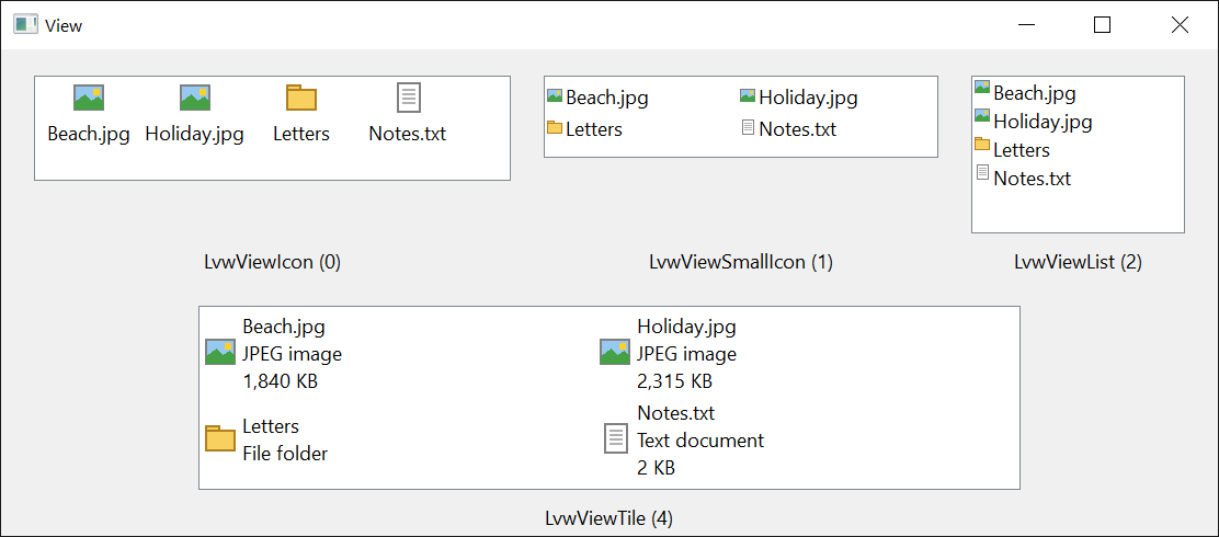
View decides how the items are shown:
| View | The items are shown |
|---|---|
| LvwViewIcon | as large icons with the text under them, in rows |
| LvwViewSmallIcon | as small icons with the text beside them, in rows |
| LvwViewList | as small icons with the text beside them, in columns of one width, ColumnWidth |
| LvwViewReport | as rows of a table, one column for the text and one for each subitem, under a header of columns |
| LvwViewTile | as large icons with the text and up to TileViewLines subitems beside them |
The report view is the only one that shows the column headers and the subitems in columns; the tile view shows the subitems that an item’s TileViewIndices names. The groups are shown in every view but the list view.
The image lists
An item takes its large icon from the image list of Icons, in the icon and tile views, and its small icon from that of SmallIcons, in the others. The item names its icons by their number or their key in that list, as its Icon and SmallIcon; the subitems take theirs from SmallIcons as well.
Each of the image list properties takes an ImageList control, the name of one that is on the same form, as a String, or the handle of an image list of Windows. It then returns the ImageList control, or the handle that was given. A name that no image list of the form has gives the control no list, and the property then returns Nothing. An object that is not an ImageList raises run-time error 35610, Invalid object, and a value of another type raises run-time error 13.
The control uses the image list of Windows that the ImageList has when it is given it. A program that clears the ImageList, or removes its last picture, gives it to the control again once it has pictures.
Arranging the icons
In the icon, small icon and tile views every item has a place of its own, which the user can change by dragging the item and the program by its Left and Top. Arrange can align the items to the left or the top edge, and can arrange them again after each change. SnapToGrid puts an item that the user drops on the nearest place of a grid. IconSpacingWidth and IconSpacingHeight are the distances between the places in the icon view.
Work areas
WorkAreas divides the control into rectangles, each of which holds icons of its own, in the icon, small icon and tile views. The control arranges the items in the first one, and the user can drag an item into another. The LvwWorkAreas page has the details.
With ListView1
    .View = LvwViewIcon
    .WorkAreas.Add 0, 0, 1500, 1500
    .WorkAreas.Add 1500, 0, 1500, 1500
    .ListItems.Add , , "first"
    Debug.Print .WorkAreas.Count; .ListItems(1).WorkArea.Index
End With
' Output:
'  2  1
Scrolling and size
TopItem is the first item that can be seen, and GetVisibleCount the number of items the control has room for. Scroll scrolls the control by a distance, and an item’s EnsureVisible scrolls it into view. ComputeControlSize works out how large the control must be to show a number of items.
Properties
Arrange
How the icons are placed in the icon, small icon and tile views. A member of LvwArrangeConstants. Default: LvwArrangeNone.
Another value raises run-time error 380.
In virtual mode the items are always arranged automatically, and a value other than LvwArrangeNone raises run-time error 383.
ColumnWidth
The width of the columns in the list view, in the scale units of the control’s container. Single.
It has a meaning in the list view only. Reading it in another view raises run-time error 394, and an assignment in another view raises run-time error 383. A width of 0 or less raises run-time error 380.
IconSpacingHeight, IconSpacingWidth
The distance from the top of one icon’s place to the top of the next, and from the left of one to the left of the next, in the scale units of the control’s container. Single. They can be read in the icon and small icon views and set in the icon view. Reading them in another view raises run-time error 394, setting them in another raises run-time error 383, and a negative value raises run-time error 380. ResetIconSpacing gives back the spacing of Windows.
Icons
The image list of the large icons. Variant: an ImageList control, its name or the handle of an image list; see The image lists. Default: none. It is assigned with Set, or without it for a name or a handle.
LabelWrap
Whether the text of an item in the icon view goes on to more lines when it is wider than the icon. Boolean. Default: True. With False the text is on one line, cut off where it is too long.
SmallIcons
The image list of the small icons, used in the small icon, list and report views, and for the icons of the subitems. Variant: as for Icons. Default: none.
SnapToGrid
Whether an item that the user drops in the icon, small icon or tile view goes to the nearest place of a grid. Boolean. Default: False.
TileViewLines
The number of subitems an item can show under its text in the tile view. Long, from 0 to 20. Default: 1.
A value outside that range raises run-time error 380.
TopItem
The first item that can be seen at the top of the control. An LvwListItem, read-only. Nothing when the control has no items.
View
How the items are shown. A member of LvwViewConstants. Default: LvwViewIcon. See The five views.
Another value raises run-time error 380.
In virtual mode LvwViewTile raises run-time error 383.
WorkAreas
The work areas of the control, as an LvwWorkAreas collection. Read-only. In virtual mode reading it raises run-time error 91.
Methods
ComputeControlSize
Works out the width and the height the control needs to show a number of items in the current view.
Syntax: object.ComputeControlSize VisibleCount, Width, Height [, ProposedWidth ] [, ProposedHeight ]
- VisibleCount
- required A Long: the number of items. A negative number raises run-time error 380.
- Width, Height
- required Single variables that receive the size, border included, in the scale units of the control’s container.
- ProposedWidth, ProposedHeight
- optional Single: a size to start from. Without them, or with 0, the control’s own size is used.
GetVisibleCount
Returns the number of items that the control has room for, without scrolling, in the list and report views. In the icon, small icon and tile views it returns the number of items. Long.
Syntax: object.GetVisibleCount( ) As Long
ResetIconSpacing
Gives the icon view the spacing between icons of Windows again, after IconSpacingWidth or IconSpacingHeight changed it.
Syntax: object.ResetIconSpacing
Scroll
Scrolls the contents of the control.
Syntax: object.Scroll X, Y
- X, Y
- required Single: the distances to scroll to the right and down, in the scale units of the control’s container; negative ones scroll to the left and up. In the report view a vertical distance is rounded to whole rows.
TextWidth
Returns how wide a text is in the control’s font, in the scale units of the control’s container. Single. 0 for an empty string.
Syntax: object.TextWidth( Text ) As Single
- Text
- required A String.
Events
AfterScroll, BeforeScroll
Raised when the contents of the control start to scroll, and when they have scrolled. A program that keeps a window of its own over the control, such as an edit box over a subitem, moves or hides it here.
Syntax: object_AfterScroll( ByVal DeltaX As Single, ByVal DeltaY As Single )
- DeltaX, DeltaY
- The horizontal and the vertical distance of the scroll that Windows reports, in the scale units of the control’s container.
LvwViewConstants
The values of View.
| Member | Value | Description |
|---|---|---|
| LvwViewIcon | 0 | Large icons, with the text under them. |
| LvwViewSmallIcon | 1 | Small icons, with the text beside them, in rows. |
| LvwViewList | 2 | Small icons, with the text beside them, in columns. |
| LvwViewReport | 3 | A table with a header and a column for each subitem. |
| LvwViewTile | 4 | Large icons, with the text and some subitems beside them. |
LvwArrangeConstants
The values of Arrange.
| Member | Value | Description |
|---|---|---|
| LvwArrangeNone | 0 | The items stay where they are put. |
| LvwArrangeAutoLeft | 1 | The items are arranged in columns from the left edge, again after each change. |
| LvwArrangeAutoTop | 2 | The items are arranged in rows from the top edge, again after each change. |
| LvwArrangeLeft | 3 | The items are aligned in columns from the left edge, and stay where they are put after that. |
| LvwArrangeTop | 4 | The items are aligned in rows from the top edge, and stay where they are put after that. |
See Also
- ListView control
- ImageList control – the pictures of the icons
- LvwWorkAreas class – the work areas