Editing, Combo Boxes and Check Boxes
The 13 enumerations that the topic pages Editing Cells, Drop-Down Lists, Buttons and Calendars, Check Boxes and Data Binding of the VBFlexGrid control use are listed here in alphabetical order. Every enumeration is declared inside the control, and its members are written without a qualifier or with the name of the enumeration, as in FlexChecked or FlexCheckBoxConstants.FlexChecked.
- FlexCellCheckReasonConstants
- FlexCheckBoxAlignmentConstants
- FlexCheckBoxConstants
- FlexCheckBoxDrawModeConstants
- FlexComboButtonDrawModeConstants
- FlexComboButtonValueConstants
- FlexComboCueConstants
- FlexComboDropDownReasonConstants
- FlexComboModeConstants
- FlexDataSourceFlags
- FlexEditCloseModeConstants
- FlexEditReasonConstants
- FlexLeftRightAlignmentConstants
FlexCellCheckReasonConstants
How the user changed the check box of a cell, as the Reason argument of the CellBeforeCheck event reports it.
Setting CellChecked from code raises no CellBeforeCheck event, so no member stands for code.
| Member | Value | Description |
|---|---|---|
| FlexCellCheckReasonMouse | 0 | The user clicked the check box or double-clicked it. |
| FlexCellCheckReasonKeyboard | 1 | The user pressed the space key. |
FlexCheckBoxAlignmentConstants
Where a check box is drawn in a cell. It is used by the ColCheckBoxAlignment and FixedCheckBoxAlignment properties.
FixedCheckBoxAlignment also accepts -1, which is not a member: the fixed cells then use the alignment of ColCheckBoxAlignment.
| Member | Value | Description |
|---|---|---|
| FlexCheckBoxAlignmentLeftTop | 0 | At the left, at the top of the cell. |
| FlexCheckBoxAlignmentLeftCenter | 1 | At the left, centered vertically. |
| FlexCheckBoxAlignmentLeftBottom | 2 | At the left, at the bottom of the cell. |
| FlexCheckBoxAlignmentCenterTop | 3 | Centered horizontally, at the top. |
| FlexCheckBoxAlignmentCenterCenter | 4 | Centered horizontally and vertically. |
| FlexCheckBoxAlignmentCenterBottom | 5 | Centered horizontally, at the bottom. |
| FlexCheckBoxAlignmentRightTop | 6 | At the right, at the top of the cell. |
| FlexCheckBoxAlignmentRightCenter | 7 | At the right, centered vertically. |
| FlexCheckBoxAlignmentRightBottom | 8 | At the right, at the bottom of the cell. |
| FlexCheckBoxAlignmentUsePictureAlignment | 9 | The check box takes its horizontal position from the alignment of the cell’s picture: left for the left alignments, centered for the centered, stretched and tiled ones, right for the right alignments, and always centered vertically. This is the default of ColCheckBoxAlignment. |
FlexCheckBoxConstants
The state of the check box of a cell, which CellChecked reads and writes.
A cell without a check box has the state -1. In a column whose ColCheckBoxes is True, a cell below the fixed rows whose own state is FlexNoCheckBox reads as FlexUnchecked and shows an unchecked box. Nothing is stored in the cell, so it reads -1 again once ColCheckBoxes is set back to False. FlexNoCheckBoxEver keeps a check box away from one cell of such a column, such as a cell of a frozen row.
The four Disabled members draw the same four states grayed and ignore the user. FlexTextAsCheckBox takes its state from the text of the cell: empty text (such as a database null) shows the grayed state, and any other text is converted to True for the checked state or False for the unchecked one. The cell does not draw its text, and the program must change the text itself when the CellCheck event reports a click.
| Member | Value | Description |
|---|---|---|
| FlexNoCheckBoxEver | -2 | The cell never has a check box, even in a column whose ColCheckBoxes is True. |
| FlexNoCheckBox | -1 | The cell has no check box of its own. In a column with ColCheckBoxes it reads and shows as FlexUnchecked. |
| FlexUnchecked | 0 | An unchecked check box. |
| FlexChecked | 1 | A checked check box. |
| FlexGrayed | 2 | A grayed (indeterminate) check box. |
| FlexTextAsCheckBox | 3 | A check box whose state follows the text of the cell. |
| FlexDisabledUnchecked | 4 | A disabled, unchecked check box. |
| FlexDisabledChecked | 5 | A disabled, checked check box. |
| FlexDisabledGrayed | 6 | A disabled, grayed check box. |
| FlexDisabledTextAsCheckBox | 7 | A disabled check box whose state follows the text of the cell. |
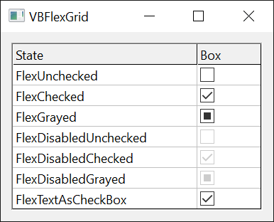
Setting and reading the state, and the text of a cell that stands for a check box:
With VBFlexGrid1
    .Rows = 3
    .Cols = 2
    .FixedRows = 1
    .FixedCols = 0
    .Row = 1
    .Col = 0
    Debug.Print .CellChecked ' -1
    .CellChecked = FlexChecked
    Debug.Print .CellChecked ' 1
    .TextMatrix(1, 0) = "True"
    .CellChecked = FlexTextAsCheckBox
    Debug.Print .CellChecked ' 3
    Debug.Print .Cell(FlexCellTextHidden) ' True
End With
FlexCheckBoxDrawModeConstants
Who draws the check boxes of the grid. It is used by the CheckBoxDrawMode property.
| Member | Value | Description |
|---|---|---|
| FlexCheckBoxDrawModeNormal | 0 | The control draws the check boxes. |
| FlexCheckBoxDrawModeOwnerDraw | 1 | The program draws them in the CheckBoxOwnerDraw event. |
FlexComboButtonDrawModeConstants
Who draws the combo buttons of the grid. It is used by the ComboButtonDrawMode property.
| Member | Value | Description |
|---|---|---|
| FlexComboButtonDrawModeNormal | 0 | The control draws the button. With ComboMode FlexComboModeButton a picture from ComboButtonPicture replaces the ellipsis. |
| FlexComboButtonDrawModeOwnerDraw | 1 | The program draws the button in the ComboButtonOwnerDraw event. |
FlexComboButtonValueConstants
The state of the combo button of the cell being edited, which ComboButtonValue reads and writes.
| Member | Value | Description |
|---|---|---|
| FlexComboButtonValueUnpressed | 0 | The normal state. A drop-down list or calendar closes. |
| FlexComboButtonValuePressed | 1 | Drops the list or calendar down, or, with ComboMode FlexComboModeButton, raises the ComboButtonClick event. |
| FlexComboButtonValueDisabled | 2 | The button is grayed and cannot be clicked. A drop-down list or calendar closes. |
FlexComboCueConstants
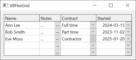
The combo cue of a cell: the drop-down arrow or the button that shows a cell can be edited with a list or a custom editor. It is used by the CellComboCue, ColComboCue and ComboCue properties.
A cue is drawn where editing is possible (AllowUserEditing is True, or AlwaysAllowComboCues is True). The cue of a cell comes from the first of CellComboCue, ColComboCue and ComboCue that is not FlexComboCueNone. ColComboCue does not apply to the fixed rows, and ComboCue applies only to the cell given by ComboCueRow and ComboCueCol, the current cell when they are -1. Clicking a cue starts editing and drops the list down or presses the button.
| Member | Value | Description |
|---|---|---|
| FlexComboCueHidden | -1 | No cue, although a column cue or the grid’s cue would apply. It takes one cell, such as a cell of a frozen row, out of the cue of its column. |
| FlexComboCueNone | 0 | No cue of this level: the next level decides. |
| FlexComboCueDropDown | 1 | A drop-down arrow. |
| FlexComboCueButton | 2 | A button. |
| FlexComboCueDisabledDropDown | 3 | A grayed drop-down arrow, which the user cannot click. |
| FlexComboCueDisabledButton | 4 | A grayed button, which the user cannot click. |
FlexComboDropDownReasonConstants
Why a drop-down list or calendar is about to drop down, as the Reason argument of the ComboBeforeDropDown event reports it.
| Member | Value | Description |
|---|---|---|
| FlexComboDropDownReasonCode | 0 | Program code: ComboButtonValue set to FlexComboButtonValuePressed. |
| FlexComboDropDownReasonInitialize | 1 | Editing has just started and the list or calendar drops down at once. |
| FlexComboDropDownReasonMouse | 2 | The user clicked the combo button. |
| FlexComboDropDownReasonKeyboard | 3 | The user pressed F4, Alt+Up or Alt+Down. |
FlexComboModeConstants
How a cell is edited with a combo: by a list, by a button or by a calendar. It is used by the ColComboMode and ComboMode properties.
A column’s ColComboMode takes precedence over the grid’s ComboMode, unless it is FlexComboModeNone: the column then uses the grid’s setting.
| Member | Value | Description |
|---|---|---|
| FlexComboModeNone | 0 | Normal editing with the text box only. |
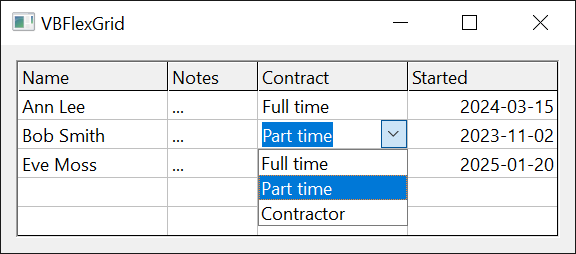
| FlexComboModeDropDown | 1 | The user changes the text only by choosing an item of the drop-down list, which drops down as editing starts. |
| FlexComboModeEditable | 2 | The user types the text or chooses an item of the drop-down list. |
| FlexComboModeButton | 3 | The text box is followed by a button, which raises ComboButtonClick so that the program can open a custom editor. ComboItems is ignored. |
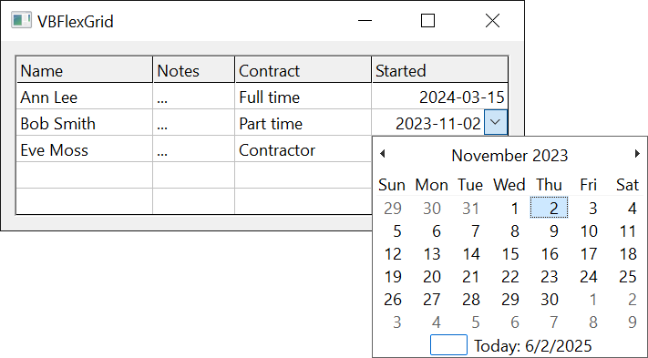
| FlexComboModeCalendar | 4 | The drop-down is a calendar. The program checks the date in the ValidateEdit event. When the text box is read-only the calendar drops down at once and a click on a date commits it. |
FlexDataSourceFlags
Options that a custom data source returns from the GetFlags method of the IVBFlexDataSource2 interface.
The values are bits, combined with Or. A custom data source that does not implement IVBFlexDataSource2 has no flags.
| Member | Value | Description |
|---|---|---|
| FlexDataSourceUnboundFixedColumns | 1 | The fixed columns are not fed by the data source: the field with number 0 appears in the first column after them, and the fixed cells keep the text that the grid holds. |
| FlexDataSourceNoData | 2 | The data source provides the fields and records, but the grid keeps its own cell texts. The functions that a data source normally disables (such as Sort) then work. |
| FlexDataSourceNoFieldNames | 4 | The grid does not ask for field names, and leaves the fixed row alone. |
| FlexDataSourceToolTipText | 8 | The grid asks the data source for the tool tip of each cell. |
| FlexDataSourceChecked | 16 | The grid asks the data source for the check box state of each cell in a column whose ColCheckBoxes is True. |
Combining the flags and testing one:
Dim Flags As Long
Flags = FlexDataSourceNoData Or FlexDataSourceChecked
Debug.Print Flags ' 18
Debug.Print (Flags And FlexDataSourceChecked) <> 0 ' True
Debug.Print (Flags And FlexDataSourceToolTipText) <> 0 ' False
FlexEditCloseModeConstants
How the last edit of a cell ended, as EditCloseMode and the CloseMode argument of the EditQueryClose event report it. EditQueryClose is not raised when the edit loses the focus, so its CloseMode is never FlexEditCloseModeLostFocus. EditCloseMode is -1, which is not a member, before the first edit and while an edit is open.
| Member | Value | Description |
|---|---|---|
| FlexEditCloseModeCode | 0 | A call of CommitEdit or CancelEdit. |
| FlexEditCloseModeLostFocus | 1 | The text box lost the focus. |
| FlexEditCloseModeEscape | 2 | The user pressed Esc, which cancels the edit. |
| FlexEditCloseModeReturn | 3 | The user pressed Enter, chose an item of a FlexComboModeDropDown list with the mouse, or clicked a date in a calendar whose box is locked. |
| FlexEditCloseModeTab | 4 | The user pressed Tab while TabBehavior is not FlexTabControls. With FlexTabControls, the default, Tab moves the focus away and the edit ends with FlexEditCloseModeLostFocus. |
| FlexEditCloseModeShiftTab | 5 | The user pressed Shift+Tab while TabBehavior is not FlexTabControls. |
| FlexEditCloseModeNavigationKey | 6 | The user pressed a navigation key while no text was selected and the caret was already at the edge that the key points to: Left at the start of the text, Right at the end, Up in the first line, Down in the last line, Home or End at the start or end of the line, or Page Up or Page Down. |
FlexEditReasonConstants
What started the edit of a cell. It is used by the EditReason property and the Reason argument of the BeforeEdit and ComboCueClick events.
The reason also decides what the text box shows first. With FlexEditReasonSpace and FlexEditReasonReturn the caret goes to the end of the text, with FlexEditReasonBackSpace the text is cleared unless the box is locked, and with any other reason the whole text is selected. The four combo reasons start editing of a cell that has a combo cue and drop the list down or press the button at once.
| Member | Value | Description |
|---|---|---|
| FlexEditReasonCode | 0 | A call of StartEdit. |
| FlexEditReasonF2 | 1 | The user pressed F2. |
| FlexEditReasonSpace | 2 | The user pressed the space key without Shift, on a cell that has no check box (the space key changes the check box of a cell that has one). |
| FlexEditReasonKeyPress | 3 | The user typed a character. |
| FlexEditReasonDblClick | 4 | The user double-clicked the cell. |
| FlexEditReasonBackSpace | 5 | The user pressed Backspace without Shift. |
| FlexEditReasonReturn | 6 | The user pressed Enter without Shift, while DirectionAfterReturn is FlexDirectionAfterReturnEdit. |
| FlexEditReasonComboCueClick | 10 | The user clicked the combo cue. |
| FlexEditReasonComboCueDblClick | 11 | The user double-clicked the combo cue. |
| FlexEditReasonComboCueF4 | 12 | The user pressed F4 on a cell with a combo cue. |
| FlexEditReasonComboCueAltUpDown | 13 | The user pressed Alt+Up or Alt+Down on a cell with a combo cue. |
FlexLeftRightAlignmentConstants
On which side of a cell the combo button or the sort arrow sits. It is used by the ColComboButtonAlignment, ColSortArrowAlignment and ComboButtonAlignment properties.
A column’s ColComboButtonAlignment takes precedence over the grid’s ComboButtonAlignment when it is not -1, which is not a member.
| Member | Value | Description |
|---|---|---|
| FlexLeftRightAlignmentLeft | 0 | At the left edge of the cell. |
| FlexLeftRightAlignmentRight | 1 | At the right edge of the cell. This is the default of ComboButtonAlignment and of ColSortArrowAlignment. |