VBFlexGrid class
A VBFlexGrid is a grid control that shows text, pictures and check boxes in rows and columns, and lets the user select, edit, sort, resize and rearrange them. It is Krool’s replacement for the Microsoft FlexGrid control of VB6 (MSFLXGRD.OCX): most of the members of that control keep their names and meanings, and the VBFlexGrid adds editing in the cell, drop-down lists, buttons and calendars in cells, check boxes, sort arrows, frozen rows and columns, merged cells, an undo queue, an incremental search and binding to data sources.
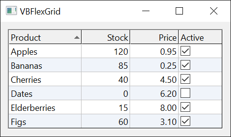
Private Sub Form_Load()
    With VBFlexGrid1
        .Rows = 4
        .FormatString = "Name|>Age|^Member"
        .TextMatrix(1, 0) = "Ann"
        .TextMatrix(1, 1) = "31"
        .TextMatrix(2, 0) = "Bob"
        .TextMatrix(2, 1) = "27"
        .TextMatrix(3, 0) = "Eve"
        .TextMatrix(3, 1) = "45"
        .ColCheckBoxes(2) = True
        .ColSort(1) = FlexSortNumericAscending
        .AllowUserResizing = FlexAllowUserResizingColumns
    End With
End Sub

Private Sub VBFlexGrid1_CellClick(ByVal Row As Long, ByVal Col As Long, ByVal Button As Integer)
    Debug.Print "Clicked row " & Row & ", column " & Col
End Sub
The class has 412 members, which this section groups by topic. The members that every control of a form has, and the few that concern only the control as a whole, are on this page. Every other member is on one of the topic pages below.
Adding the control to a form
Add the package to the project as Importing a package from TWINSERV describes. The control is then in the Toolbox like any other: select VBFlexGrid and draw it on the form. In code the control is named as any other control on the form is, VBFlexGrid1 for the first one.
A new control has two rows and two columns, the first row and the first column being fixed, and it uses the system colors. Its properties can be set in the Properties window or in code. Rows and columns are numbered from 0, and a cell is addressed by its row and its column: VBFlexGrid1.TextMatrix(2, 1) = "text" sets the text of the cell in the third row and the second column.
Most of the members raise an error for a row or a column that the grid does not have, and for a value that is not a member of the enumeration the property takes. The errors that many members share:
| Number | Description | Raised for |
|---|---|---|
| 380 | Invalid property value | a value that is not a member of the enumeration, or a number out of the range the property accepts |
| 381 | Subscript out of range | a row or column argument of a method that the grid does not have |
| 383 | Property is read-only | an assignment to a property that can only be read |
| 394 | Property is write-only | reading a property that can only be written |
| 30009 | Invalid Row value | a row index below 0 or past the last row |
| 30010 | Invalid Col value | a column index below 0 or past the last column |
In a form’s designer, the Properties window shows a message box with the same text instead of raising the error.
Topics
- Rows and Columns – the number of rows and columns, fixed and frozen ones, hidden ones, adding, removing and moving them, row identifiers, column keys and user data, and the FormatString that sets up the headers.
- Sizes and Positions – row heights and column widths, resizing by the user, best fit, the position and size of cells and of the client area, and text measures.
- Cell Text – reading and writing the text of cells, number and date formats, data types, lookups, tags, tool tips, word wrap and ellipsis.
- Cell Formatting – alignment, colors, fonts, text style, pictures and flood bars of single cells and of columns, and FillStyle.
- Merging Cells – cells with equal contents shown as one cell.
- Current Cell and Selection – the current cell, the selected range, selection modes, selection of several ranges, highlight and focus rectangle, and keyboard navigation.
- Scrolling – scroll bars, the visible part of the grid, scroll tips and reader mode.
- Mouse, Keyboard and Drag and Drop – hit testing, mouse and key events, the mouse pointer, OLE drag and drop, dropped files, insert marks and drop highlights.
- Editing Cells – editing a cell in place, by the user and by code, with its edit box and its events.
- Drop-Down Lists, Buttons and Calendars – editing a cell with a drop-down list, a combo button or a calendar, and the cues that show it.
- Check Boxes – check boxes in cells.
- Sorting and Searching – sorting by code and by the user, sort arrows, custom comparison, finding items and tags, and the incremental search.
- Clipboard, Undo and Arrays – Clip and its separators, cut, copy, paste and delete, the undo queue, loading and saving arrays.
- Data Binding – binding to a data source or a recordset, and to an object that implements IVBFlexDataSource.
- Appearance – colors, grid lines, borders, fonts, the picture of the grid, the wallpaper, visual styles and right-to-left layout.
The constants that the members take are in Enumerations. The interfaces for a data source of your own are IVBFlexDataSource and IVBFlexDataSource2.
Properties
Align
Returns or sets how the control aligns itself in its container.
Syntax: object.Align [ = value ]
- value
- An Integer: 0 for no alignment (the default), 1 to align to the top of the container, 2 to the bottom, 3 to the left, 4 to the right. On an ordinary form the assignment is accepted and the property keeps reading 0; a value other than 0 has an effect only in a container that supports aligned controls.
Container
Returns or sets the container of the control: the form, or the frame or picture box on the form, that holds it.
Syntax: object.Container [ = value ]
- value
- An Object, such as a Frame or a PictureBox on the form, set with Set. Assigning another container moves the control into it.
DoubleBuffer
Returns or sets whether the control paints into a bitmap in memory first and copies it to the window in one step. Boolean. Default: True. Double buffering avoids the flicker of a grid that is painted cell by cell, at the cost of the memory for the bitmap, which is as large as the control.
DragIcon
Returns or sets the picture shown as the mouse pointer during a drag-and-drop operation that the Drag method started. An IPictureDisp, set with Set. Default: none.
DragMode
Returns or sets whether a drag starts when the user presses the mouse button on the control (1, automatic) or only when the program calls Drag (0, manual). Integer. Default: 0.
Enabled
Returns or sets whether the control responds to the user. Boolean. Default: True. A control that is not enabled does not respond to the mouse or the keyboard.
Height
Returns or sets the height of the control. Single, in the units of the container’s scale (twips for a form that has not changed its ScaleMode).
HelpContextID
Returns or sets the context number in the help file of the program for the control. Long. Default: 0.
hWnd
Returns the handle of the window of the grid. A LongPtr.
The control is made of a window of the UserControl, which is the one that the form shows, and of a child window inside it, which is the grid. hWnd is the child window, the one that receives the mouse and the keyboard and the one to pass to a Windows API function that works on the grid. hWndUserControl is the window around it.
hWndToolTip
Returns the handle of the tool tip window that shows the tips of cells. A LongPtr. It is 0 until a tool tip is needed, which is when ShowInfoTips or ShowLabelTips is True.
hWndUserControl
Returns the handle of the window of the UserControl, the window around the grid that the form positions. A LongPtr. See hWnd for the window of the grid itself.
Left
Returns or sets the distance between the left edge of the control and the left edge of its container. Single, in the units of the container’s scale.
Name
Returns the name that the form’s designer gave to the control, such as VBFlexGrid1. A String. Read-only.
Parent
Returns the form (or other object) on which the control is. An Object. Read-only.
Redraw
Returns or sets whether the control repaints itself when its contents change. Boolean. Default: True.
Set Redraw to False before a long series of changes, such as filling thousands of cells, and to True after it. While it is False the control does not repaint; setting it to True again repaints the control and brings its scroll bars up to date.
With VBFlexGrid1
    .Redraw = False
    .Rows = 1001
    .Cols = 3
    Dim i As Long
    For i = 1 To 1000
        .TextMatrix(i, 1) = "Item " & i
    Next i
    .Redraw = True
    Debug.Print "Last row: " & .TextMatrix(.Rows - 1, 1) ' Last row: Item 1000
End With
Tag
Returns or sets a String that the program can use for its own purposes, as the Tag property of any control. Default: an empty string.
ToolTipText
Returns or sets the text that Windows shows when the mouse pointer rests on the control, outside any cell that has a tool tip of its own. A String. Default: an empty string. The tips of single cells are CellToolTipText.
Top
Returns or sets the distance between the top edge of the control and the top edge of its container. Single, in the units of the container’s scale.
Version
Returns 600. An Integer. It is the version of the Microsoft FlexGrid control (6.0) that the VBFlexGrid replaces, so that a program that tests the version of that control finds the number it expects.
Visible
Returns or sets whether the control is visible. Boolean. Default: True.
WhatsThisHelpID
Returns or sets the context number in the help file for the control’s “What’s This?” help. Long. Default: 0.
Width
Returns or sets the width of the control. Single, in the units of the container’s scale.
Methods
Drag
Starts, ends or cancels a drag operation of the control, as the Drag method of any VB control does.
Syntax: object.Drag [ Action ]
- Action
- optional A Variant: 0 cancels the drag, 1 (the default) starts it, 2 ends it by dropping.
This is the drag of VB’s DragMode and DragIcon, not an OLE drag-and-drop operation; for that see OLEDrag.
Refresh
Repaints the control at once, with all its contents.
Syntax: object.Refresh
SetFocus
Moves the focus to the control.
Syntax: object.SetFocus
ZOrder
Places the control at the front or at the back of the controls of its container.
Syntax: object.ZOrder [ Position ]
- Position
- optional A Variant: 0 (the default) puts the control at the front, 1 at the back.
Example
This example shows a grid of five rows and three columns, reads back some of its standard members and prints them.
With VBFlexGrid1
    .Rows = 5
    .Cols = 3
    .Tag = "inventory"
    .Left = 120
    .Top = 240
    .Width = 3000
    .Height = 2000
    Debug.Print .Name & " " & .Tag & " " & .Left & " " & .Top & " " & .Width & " " & .Height
    Debug.Print TypeName(.Parent) & " " & .Version & " " & (.hWnd <> .hWndUserControl)
End With
' Output:
' VBFlexGrid1 inventory 120 240 3000 2000
' Form1 600 True
See Also
- Rows and Columns – the shape of the grid
- Appearance – colors, lines and borders
- Enumerations – the constants the members take
- VBFLXGRD18 Package – the package