Appearance
The members that set the colors, grid lines, borders, fonts and text style of a VBFlexGrid, give it a background picture, return a picture of it, and turn on visual styles and right-to-left layout.
A cell is drawn from these settings of the whole grid, which Cell Formatting can override for a single cell, a range of cells or a column:
| Part of the grid | Background | Text color | Font | Text style | Grid lines |
|---|---|---|---|---|---|
| Normal cells | BackColor, and BackColorAlt in every second row | ForeColor | Font | TextStyle | GridLines, GridColor, GridLineWidth |
| Fixed cells | BackColorFixed | ForeColorFixed | FontFixed | TextStyleFixed | GridLinesFixed, GridColorFixed, GridLineWidthFixed |
| Frozen cells | as the normal cells | as the normal cells | as the normal cells | as the normal cells | GridLinesFrozen, GridColorFrozen, GridLineWidthFrozen |
| Selected cells | BackColorSel | ForeColorSel, when UseForeColorSel is True | as the cell | as the cell | as the cell |
| The space outside the cells | BackColorBkg |
The colors are OLE_COLOR values: an RGB color, or a system color such as vbWindowBackground or vbHighlight. The defaults are system colors, so the grid follows the color scheme of Windows.
The grid line settings of the fixed and the frozen cells inherit: the fixed cells use GridLineWidth until GridLineWidthFixed is set, and the frozen cells use the width of the fixed cells until GridLineWidthFrozen is set. Setting the width to -1 goes back to inheriting.
With VBFlexGrid1
    .BackColor = vbYellow
    Debug.Print Hex(.BackColorAlt)           ' BackColor also sets BackColorAlt
    .BackColorAlt = vbCyan
    Debug.Print Hex(.BackColor)              ' but BackColorAlt does not set BackColor
    .GridLineWidth = 3
    Debug.Print .GridLineWidthFixed & " " & .GridLineWidthFrozen
    .GridLineWidthFixed = 2
    Debug.Print .GridLineWidthFixed & " " & .GridLineWidthFrozen
    .GridLineWidthFrozen = 4
    Debug.Print .GridLineWidthFrozen
End With
' Output:
' FFFF
' FFFF
' 3 3
' 2 2
' 4
The grid can show a picture behind its cells (WallPaper) and can produce a picture of itself (Picture). The members of Sizes and Positions measure the cells, and those of Cell Formatting change one cell.
Properties
BackColor
Returns or sets the background color of the normal cells. An OLE_COLOR. Default: vbWindowBackground.
Syntax: object.BackColor [ = value ]
Setting it sets BackColorAlt to the same color, so that every row has this color. A cell whose CellBackColor is set keeps its own color.
BackColorAlt
Returns or sets the background color of every second row of the normal cells. An OLE_COLOR. Default: vbWindowBackground, the same as BackColor, which gives no alternating rows.
Syntax: object.BackColorAlt [ = value ]
When it differs from BackColor, the rows alternate: counted from the first row that is not fixed, the first, third and so on have BackColor, and the second, fourth and so on have this color. Assign BackColorAlt after BackColor, since assigning BackColor changes both. The edit box of a cell that is being edited takes the color of its row.
BackColorBkg
Returns or sets the color of the space of the control that no cell covers, which is the area to the right of the last column and under the last row. An OLE_COLOR. Default: &H808080&, a gray.
Syntax: object.BackColorBkg [ = value ]
BackColorFixed
Returns or sets the background color of the fixed cells. An OLE_COLOR. Default: vbButtonFace.
Syntax: object.BackColorFixed [ = value ]
BackColorSel
Returns or sets the background color of the selected cells. An OLE_COLOR. Default: vbHighlight.
Syntax: object.BackColorSel [ = value ]
With FocusRect set to FlexFocusRectFlat, the focus rectangle is drawn in this color.
BorderStyle
Returns or sets the border of the control. A FlexBorderStyleConstants member. Default: FlexBorderStyleSunken.
Syntax: object.BorderStyle [ = value ]
The border is part of the control and not of its client area: the cells and the scroll bars are inside it, and ClientLeft and ClientTop are its width. FlexBorderStyleNone has no border, so they are 0. A value that is not a member of the enumeration raises run-time error 380.
Font
Returns or sets the font of the normal cells. A StdFont. Default: the font of the form.
Syntax: object.Font [ = value ]
Assign with Set. Assigning Nothing gives the grid the font of the form again. A change to the font object, such as VBFlexGrid1.Font.Size = 12, is applied at once: the default row heights and column widths follow the new font and the grid is repainted. A cell can have a font of its own through CellFontName and the other CellFont properties.
FontFixed
Returns or sets the font of the fixed cells. A StdFont. Default: none, which means that the fixed cells use Font.
Syntax: object.FontFixed [ = value ]
Assign with Set. Reading it returns the Font object as long as no font is set for the fixed cells. Assigning Nothing removes the font of the fixed cells again. The default height of the fixed rows and the default width of the fixed columns follow this font.
FontQuality
Returns or sets how Windows renders the font. A FlexFontQualityConstants member. Default: FlexFontQualityDefault.
Syntax: object.FontQuality [ = value ]
The quality applies to every font of the grid, those of the cells included, and the grid creates its fonts again when it changes. A value that is not a member of the enumeration raises run-time error 380.
ForeColor
Returns or sets the text color of the normal cells. An OLE_COLOR. Default: vbWindowText.
Syntax: object.ForeColor [ = value ]
A cell whose CellForeColor is set keeps its own color.
ForeColorFixed
Returns or sets the text color of the fixed cells. An OLE_COLOR. Default: vbButtonText.
Syntax: object.ForeColorFixed [ = value ]
ForeColorSel
Returns or sets the text color of the selected cells. An OLE_COLOR. Default: vbHighlightText.
Syntax: object.ForeColorSel [ = value ]
It is used only when UseForeColorSel is True.
GridColor
Returns or sets the color of the grid lines between the normal cells. An OLE_COLOR. Default: &HC0C0C0&, a light gray.
Syntax: object.GridColor [ = value ]
The color applies to the styles FlexGridLineFlat, FlexGridLineDashes and FlexGridLineDots and their horizontal and vertical variants. The styles FlexGridLineInset and FlexGridLineRaised draw black and white lines and ignore it.
GridColorFixed
Returns or sets the color of the grid lines between the fixed cells. An OLE_COLOR. Default: vbBlack.
Syntax: object.GridColorFixed [ = value ]
The same applies as for GridColor: the default style of the fixed cells, FlexGridLineInset, ignores the color. It colors the line that SheetBorder draws.
GridColorFrozen
Returns or sets the color of the grid lines of the frozen cells. An OLE_COLOR. Default: vbBlack.
Syntax: object.GridColorFrozen [ = value ]
The same applies as for GridColor.
GridLines
Returns or sets the style of the grid lines between the normal cells. A FlexGridLineConstants member. Default: FlexGridLineFlat.
Syntax: object.GridLines [ = value ]
The styles are a plain line (FlexGridLineFlat), a dashed line (FlexGridLineDashes), a dotted line (FlexGridLineDots), and a pair of black and white lines that gives the cells a sunken (FlexGridLineInset) or a raised look (FlexGridLineRaised). Each of them has a variant with Horz and one with Vert in its name that draws the horizontal or the vertical lines only. FlexGridLineNone draws no lines. The color and the width of the plain, dashed and dotted lines are GridColor and GridLineWidth. A value that is not a member of the enumeration raises run-time error 380.
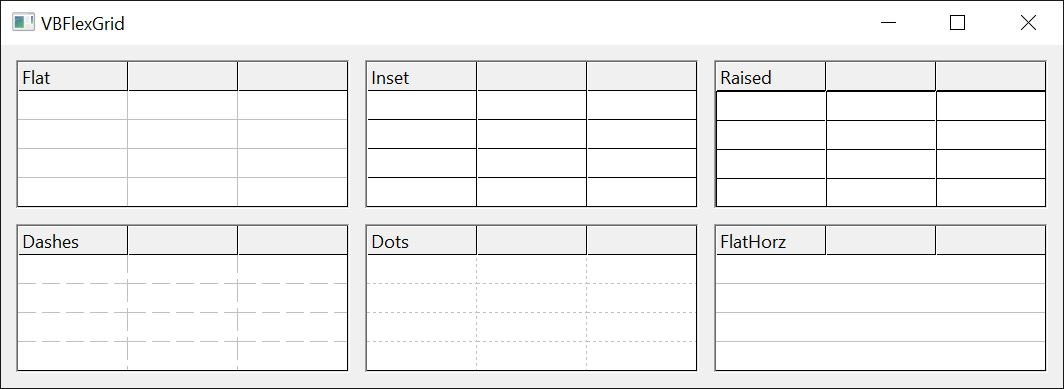
The offsets of the grid lines, which GetGridLineOffsets returns, follow the style only when FixGridLineOffsets is True.
GridLinesFixed
Returns or sets the style of the grid lines between the fixed cells. A FlexGridLineConstants member. Default: FlexGridLineInset.
Syntax: object.GridLinesFixed [ = value ]
The styles are those of GridLines; the color and the width are GridColorFixed and GridLineWidthFixed. A value that is not a member of the enumeration raises run-time error 380.
GridLinesFrozen
Returns or sets the style of the grid lines of the frozen cells. A FlexGridLineConstants member. Default: FlexGridLineFlat.
Syntax: object.GridLinesFrozen [ = value ]
The styles are those of GridLines; the color and the width are GridColorFrozen and GridLineWidthFrozen. They are the lines at the edge of the frozen rows and columns. A value that is not a member of the enumeration raises run-time error 380.
GridLineWidth
Returns or sets the width of the grid lines between the normal cells, in pixels. An Integer. Default: 1.
Syntax: object.GridLineWidth [ = value ]
A value below 1 raises run-time error 380. The width is also the width of the grid lines of the fixed and the frozen cells, until GridLineWidthFixed and GridLineWidthFrozen are set.
GridLineWidthFixed
Returns or sets the width of the grid lines between the fixed cells, in pixels. An Integer. Default: -1, which means the width of GridLineWidth.
Syntax: object.GridLineWidthFixed [ = value ]
Reading returns the width that is in use, never -1. A value that is below 1 and is not -1 raises run-time error 380.
GridLineWidthFrozen
Returns or sets the width of the grid lines of the frozen cells, in pixels. An Integer. Default: -1, which means the width of GridLineWidthFixed, and when that is -1 as well, the width of GridLineWidth.
Syntax: object.GridLineWidthFrozen [ = value ]
Reading returns the width that is in use, never -1. A value that is below 1 and is not -1 raises run-time error 380.
MirrorAlignGeneral
Returns or sets whether the general alignment is mirrored. Boolean. Default: False.
Syntax: object.MirrorAlignGeneral [ = value ]
A cell with the general alignment (FlexAlignmentGeneral, see CellAlignment) puts text on the side where reading starts, which is the left in a left-to-right grid, and numbers and dates on the other side. With True it is the other way round: a text goes to the right and a number to the left. The property is meant for grids that are read from right to left (see RightToLeft) in which the numbers are expected on the side where the reading starts.
Picture
Returns a picture of the grid. An IPictureDisp. Read-only.
Syntax: object.Picture
The picture shows the fixed and frozen rows and columns, followed by the rows and columns from the first visible one to the last one of the grid. It is the whole width and height of those cells, not only the part that fits into the control. What is scrolled out of view above or to the left is not in it. The picture can be copied to the clipboard, saved or printed, or assigned to a picture box. PictureType selects its kind.
With VBFlexGrid1
    .Rows = 6
    .Cols = 4
    Debug.Print .Picture.Type & " " & .PictureType      ' a bitmap, the default type
    .PictureType = FlexPictureTypeEnhMetafile
    Debug.Print .Picture.Type                           ' an enhanced metafile
End With
' Output:
' 1 0
' 4
PictureType
Returns or sets the kind of picture that Picture returns. A FlexPictureTypeConstants member. Default: FlexPictureTypeColor.
Syntax: object.PictureType [ = value ]
FlexPictureTypeColor gives a color bitmap and FlexPictureTypeMonochrome a black-and-white bitmap, both of the type 1 (vbPicTypeBitmap). FlexPictureTypeEnhMetafile gives an enhanced metafile, of the type 4 (vbPicTypeEMetafile), which can be scaled without loss. A value that is not a member of the enumeration raises run-time error 380.
RightToLeft
Returns or sets whether the text is read from right to left. Boolean. Default: the setting of the form.
Syntax: object.RightToLeft [ = value ]
With True the text of the cells and of the edit box is drawn in right-to-left reading order. With RightToLeftLayout also True the control is mirrored as a whole: the scroll bar is on the left, and the columns run from the right. Assigning True does not always set it: RightToLeftMode decides when the grid follows the setting. After the assignment the property reads back the value that applies.
RightToLeftLayout
Returns or sets whether the control is mirrored when RightToLeft is True. Boolean. Default: False.
Syntax: object.RightToLeftLayout [ = value ]
With False, RightToLeft changes only the reading order of the text. With True, the whole grid is mirrored, so that the first column is on the right and the scroll bar on the left. It has no effect while RightToLeft is False.
RightToLeftMode
Returns or sets when an assignment of True to RightToLeft takes effect. A FlexRightToLeftModeConstants member. Default: FlexRightToLeftModeVBAME.
Syntax: object.RightToLeftMode [ = value ]
| Value | RightToLeft is set to True |
|---|---|
| FlexRightToLeftModeNoControl | always, as assigned |
| FlexRightToLeftModeVBAME | as the UserControl that holds the grid accepts it |
| FlexRightToLeftModeSystemLocale | only when the default language of the system is written from right to left |
| FlexRightToLeftModeUserLocale | only when the language of the user’s settings is written from right to left |
| FlexRightToLeftModeOSLanguage | only when the language of the user interface of Windows is written from right to left |
In the other cases the property stays False. A value that is not a member of the enumeration raises run-time error 380.
SheetBorder
Returns or sets whether a line is drawn at the end of the sheet. Boolean. Default: True.
Syntax: object.SheetBorder [ = value ]
The line closes the sheet on its bottom edge, under the last row, and on its right edge, after the last column, in the color of GridColorFixed. The lines of the cells are drawn on the right and at the bottom of each cell, so without the line the last row and column would have none on the outer side.
TextStyle
Returns or sets the 3D effect of the text in the normal cells. A FlexTextStyleConstants member. Default: FlexTextStyleFlat.
Syntax: object.TextStyle [ = value ]
The effects draw the text a second time in a shifted position, in gray or white. FlexTextStyleRaised gives the text a gray shadow and a white highlight on the other side, so that it seems to stand out of the cell, FlexTextStyleInset the reverse, so that it seems pressed in. The Light variants draw only the white copy. A value that is not a member of the enumeration raises run-time error 380. A cell’s own effect is CellTextStyle.
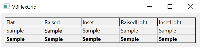
TextStyleFixed
Returns or sets the 3D effect of the text in the fixed cells. A FlexTextStyleConstants member. Default: FlexTextStyleFlat.
Syntax: object.TextStyleFixed [ = value ]
The effects are those of TextStyle.
UseForeColorSel
Returns or sets whether the selected cells use ForeColorSel. Boolean. Default: True.
Syntax: object.UseForeColorSel [ = value ]
With False the selected cells keep the text color that they have when they are not selected, and only their background changes to BackColorSel. That keeps cells with their own text colors readable.
VisualStyles
Returns or sets whether the parts of the grid that Windows themes use the visual styles. Boolean. Default: True.
Syntax: object.VisualStyles [ = value ]
The scroll bars, the check boxes, the combo buttons, the drop-down lists, the calendar, the edit box and the tool tips are drawn in the theme of Windows when the program has visual styles on. With False they have the classic look. The setting changes nothing when the program has no visual styles.
WallPaper
Returns or sets a picture that is shown behind the cells that are not fixed. An IPictureDisp. Default: none.
Syntax: object.WallPaper [ = value ]
Assign with Set; assigning Nothing removes the picture. Without a wallpaper the property reads Nothing; after a wallpaper was removed it returns a picture object that has no image, whose Handle is 0, as the Picture property of a form does. The picture shows through the cells that have the default background, which means that BackColor is not painted over it, and it is covered by the cells whose CellBackColor is set and by the selection. Its place and size in the area are given by WallPaperAlignment. The grid keeps a copy, so changing the source picture does not change the wallpaper.
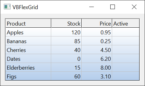
WallPaperAlignment
Returns or sets where the wallpaper is placed. A FlexWallPaperAlignmentConstants member. Default: FlexWallPaperAlignmentStretch.
Syntax: object.WallPaperAlignment [ = value ]
The picture is placed at one of the nine positions (left, center and right at the top, in the middle and at the bottom), stretched over the whole area (FlexWallPaperAlignmentStretch) or repeated (FlexWallPaperAlignmentTile). A value that is not a member of the enumeration raises run-time error 380.
With VBFlexGrid1
    Debug.Print .WallPaper Is Nothing
    Set .WallPaper = .Picture
    Debug.Print .WallPaper.Handle <> 0
    Set .WallPaper = Nothing
    Debug.Print .WallPaper.Handle
    On Error Resume Next
    .WallPaperAlignment = 99
    Debug.Print Err.Number
End With
' Output:
' True
' True
' 0
' 380
See Also
- Cell Formatting – colors, fonts and text style of single cells and columns
- Sizes and Positions – grid line offsets, and the sizes that follow the font
- Current Cell and Selection – the highlight and the focus rectangle
- Scrolling – scroll bars
- FlexBorderStyleConstants – borders
- FlexFontQualityConstants – font rendering quality
- FlexGridLineConstants – grid line styles
- FlexPictureTypeConstants – kinds of picture
- FlexRightToLeftModeConstants – right-to-left modes
- FlexTextStyleConstants – 3D effects of text
- FlexWallPaperAlignmentConstants – places of the wallpaper